10 Signs Your Website Needs Updating, Stat!
We're on a mission to rid the web of janky websites. Here's how to know if your site's janky.
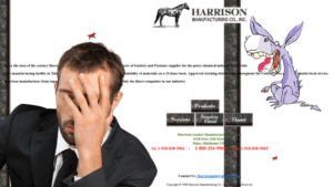
You may not see the need to perform regular updates on your small business website. Your site is fine, right? Right? *quickly Googles “when to update website”*
Well, you may not see the need, but the hackers that want to gain access to your site sure do. And they’re hoping you won’t, and that you’ll leave yourself open to attack.
Your customers will see the need too, when they leave your site because it looks dated and unprofessional. Or because they can’t find the information they need.
Every business owner knows: there’s no part of your business that you can leave alone… if you expect it to perform well. You need to stay invested and keep your site updated and current.
So how can you tell when it’s time to update your small business website? Here are 10 signs that it’s time for an update:
Sign #1: You can’t remember the Last Time You Updated Your Website
First off, think back to your last update. How long ago was that?
Wait… do you even know?
If you don’t have a log to keep track of your latest updates, be sure to get on that. If your last website update hasn’t been done in recent memory, chances are your site is looking dated. More than likely, you’ll have some broken links and some faulty pages. And, almost certainly, you’ll be dealing with out of date plugins and themes.
It’s never too late to get up to date, so get your website into gear and keep it there. Make sure you’re keeping your eye on current tech trends and have a team that can keep your site fresh and relevant.
Sign #2: Your website is open to attack
Nobody wants to be a target for attack. The thing is, most small businesses labor under the delusion that, because they are a small business, they aren’t a real target for hackers.
Sorry. No such luck. Your site can be under potential attack just by existing within a web application and using dated plugins.
What does that mean? Well, let’s say you use WordPress for your site, and you choose an old theme or plugin that hasn’t been updated in a while. A hacker could be running an automated system to check for vulnerabilities throughout all of WordPress. If they identify a way in through a plugin or a theme, they can access any site that uses that component.
Hackers are opportunists. They take whatever in they can find. So even if your business is small, or not very well known, it can still have a huge target hovering over it.
That’s the thing about web security: your website is only as safe as its weakest component. If an outdated theme or plugin allows a hacker to access your system, they can access your whole system.
This is why it’s important to consistently update all the facets of your website, to be sure that you don’t give any malevolent forces on the web a toehold into your system.
How can you do this? By knowing the most critical risks to your website and learning how to overcome them. Check out our Ultimate Guide To Securing Your Business Website. And, don’t forget, always make sure that your site is undergoing consistent, professional website maintenance.
Sign #3: Your website is sloooooow
Okay, so your website loads a little slow. Not a big deal, right? Who can’t wait another few seconds to see your page?
Most people, it turns out.
We’ve talked about this before, but in a recent study, Google found that 53% of visitors were likely to abandon a site that took over 3 seconds to load. The average site? It takes 22 seconds.
Think about it from your own perspective. If you try and access a website and you watch the spinning wheel go for 5, 10, 20, 30 seconds, chances are you’re going to think that the site is broken and navigate away from the page to find a different Google result.
So, when it comes to your page load speed, remember that slow and steady does not win the race for more customers. Keep your website updated so that it’s moving quickly!
We talk about some of these speed factors in our post on Google’s new mobile speed update. And to tackle one of the biggest culprits on the speed front… images… check out our post on how to Optimize Images For Speed.
Sign #4: Your website isn’t mobile-friendly
How would you like to be limited to 40% of your potential business?
Okay, that’s a dumb question. You want 100% of potential business. You’d take a higher percentage if the rules of mathematics allowed it.
But as strange as it sounds, that’s the reality for a lot of business websites out there.
The way people use the internet is constantly changing, and one of the big changes in recent years is the prevalence of internet searching on mobile devices. Over 60% of searches are happening on mobile devices. And 40% of those mobile searches have local intent… these are folks who are looking for an immediate local solution to an issue.
So if your website hasn’t been updated so that it’s easy to use on a mobile device, you have the potential to lose all of that business to a competitor.
Do you have to pinch and zoom to read your site on a phone screen? Do you have to scroll horizontally to see all the content on a page? Does it take a long time to load? All of these things are major issues that can drive people on mobile devices away from your site… and away from your business.
Sign #5: People can’t find your Website
Okay, this one’s a no-brainer. People can’t buy from you if they can’t find you.
This is one that most everybody understands, but few people know how to fix. They just know that, somehow, it probably has something to do with Google.
That’s one of the biggest questions we get from our potential clients at SuperWebPros. “How can our site rank higher in Google?” Which is a great question, with a complicated answer. But it’s really part of the much bigger question: “How can we get more people to find our website?”
Active & Passive Strategies
Part of that equation is active: your promotion strategy. Are you advertising? Do you have a social media presence? If you neglect to promote your business, you won’t see the kind of online growth you want to see.
The passive part of that equation is search. Letting customers find you.
People who used to reach for the phone book are now pulling open a Google tab. So it makes sense to make sure your website is updated with at least some basic search engine optimization (SEO) techniques.
Now, it used to be that if you loaded your site with appropriate keywords, you could find yourself at the top of the list on Google’s search list. But it’s not that simple anymore. Google’s algorithms have gotten smarter, you can’t just load up on keywords and secure that coveted #1 slot.
Here’s the good news: that’s not a bad thing.
Google tends to reward a few things: consistency, quality, speed, and locality are among them. Which means that, if you are a relevant local business that’s regularly updating good quality content on pages that load quickly, you are setting yourself up for success.
And with new Google features like maps, answers, and snippets, it’s possible to have your content positioned even higher than the #1 ranked website. “Position Zero,” as it’s called, features posts that answer real customer questions in the most helpful and relevant way possible.
If your site is chock full of keywords but isn’t seeing the traffic it ought to see, it’s a sign that you need to update your website.
To learn some best practices on how to keep your site search-friendly, check out the speed-related articles listed above, as well as our Guide to On-Page SEO.
Sign #6: You have a high bounce rate
You got somebody to click on a link and they’ve arrived at your site. That’s a great accomplishment!
As long as they don’t immediately hit the back button once they’ve got there.
We’ve all experienced it. We click into a site and, for whatever reason, we realize that it wasn’t what we were after at all. So we click out of the site almost as fast as we got into it.
That’s a phenomenon called ‘bounce rate.’ And it can happen for a few reasons:
- Maybe your site is misrepresented with the wrong search keywords.
- Perhaps there are too many links from irrelevant sources.
- Or your site might take too long to load.
Whatever the reason, traffic that bounces is not good traffic to have. These visitors aren’t bringing you business. And Google keeps track of bounce rate… and a high bounce rate can negatively impact your search rankings.
If pages on your website have a high bounce rate, it’s time to update those pages. Use keywords that actually represent what the page offers. Manage the links to and from that page and make sure all of them are relevant. And keep your website speedy to keep impatient visitors from bouncing before it has a chance to load.
Sign #7: Your customers can’t find what they need
Imagine you’re in a grocery store. One you’ve never been to. Think about where you’d need to go to find all of the items you need.
Chances are, you can come up with a pretty good idea of where things would be. Most grocery stores have a similar layout- fresh items around the perimeter, dry goods in the middle. Every store is a little different, but each one is fairly easy to navigate.
Now, imagine a store located in a maze. And you have to solve the maze while finding your items, which are scattered throughout the maze in no particular order.
That store probably wouldn’t get much of your business.
In the same way, you don’t want your customers to have to hunt for the information they need when they’re on your website.
You want your website to be a clearly ordered digital storefront so that someone who has never visited before can clearly navigate the pages and very easily get to where they need to go.
If your website is more like the maze, it’s most definitely time to update your content hierarchy. Content hierarchy is like a map for your site, a strategy for how to layout the information your site contains in a way that is logical to your visitor.
We have a great post on the basics of content hierarchy to get you started.
Sign #8: You don’t update your Website’s blog
Businesses that blog get more leads. Lead growth is 126% higher for websites that blog, as opposed to non-blogging websites. So, chances are, you’ve heard that you should have a blog.
Maybe you even started one. But blogging takes time, and you’re busy, and… well, next thing you know, the last entry was from two years ago, welcoming readers to your new blog.
Here’s the thing: blogs are important because they show that you’re growing as a business. You’re engaged in your industry. You’re an expert in your field, and you want your authoritative voice out in the marketplace to help guide others.
If you don’t have a blog, your voice isn’t out there.
If you have a blog, but don’t update it consistently, that’s even worse. Having old, outdated posts up on your blog sends the opposite signals you intend. From the visitor’s perspective, you’re not cutting edge. You’re not engaged. And, as far as they know, you may not even be in business anymore.
How Often Should I Update My Blog?
If your blog is outdated, or the content isn’t crafted with your customer’s needs in mind, it’s time to publish some fresh content. Come up with a plan for your next few posts and just make sure you publish consistently.
Once a month, twice a month, weekly or daily, whatever you can handle.
Just don’t publish in fits and starts. You want consistent, quality posts that show your regular influence in your industry.
If you really don’t have the time to update the blog on your website, you need to make a decision. It’s better to kill your blog entirely than to have a bad one. So either shut down your blog, or, preferably, find a blogging service that is able to reliably provide good quality posts.
Sign #9: Your Website doesn’t match your brand
You have a great office. A solid logo. A professional air to your branding. Your company is cutting edge.
But how is your website? Does it look more 1998 than 2018?
You probably wouldn’t let your employees represent your company looking unkempt and wearing sweatpants. (Unless you sell sweatpants. Then maybe.)
Why? Because those employees are ambassadors for your brand. They reflect your values as a company. They give your potential customers an insight as to what working with you is really like.
Your website is your ultimate brand ambassador. It’s your digital storefront, and it represents your company to everybody that checks you out online.
Having a dated website, a cheap-looking website, or a not-particularly-functional website can drag your brand into the mud. So if your website is a source of embarrassment for you or your team, it’s time for a website update.
For ideas on how to get your site back on track, check out our Guide To The Ultimate Business Website, and learn how to design with the user in mind.
Sign #10: Your Website isn’t converting
But hey, maybe your site is pretty. You mostly stay up to date on your blog. It’s not particularly slow. You’re in good shape, right?
Perhaps. But, remember the point of having a business website. It’s a tool to help you grow your business.
Is your website failing to convert visits into leads?
Do you even have a good way to measure how effective your business website is at driving traffic to your business?
When you talk to developers, you will hear a lot of emphasis put on design. How pretty your site is. Which is fine! It’s an admirable thing to have a beautiful website.
But a beautiful website that doesn’t bring you more business is a waste of money.
If your website is failing to convert, there could be a metric ton of reasons why. Your site is slow. Information is hard to locate. It doesn’t use landing pages effectively. There are poor calls to action.
Regardless, if your site isn’t delivering when it comes to customers or leads, then it’s time for an update. It’s important to isolate the problem and upgrade to a better solution.
If you think your website isn’t living up to its potential, we’d love to talk to you. At SuperWebPros, we build, maintain, and accelerate websites to drive real, meaningful traffic to your business. Sign up for a free site audit to learn what your website is doing well, where it’s falling behind, and how it can improve to bring you better results.


