5 Amazing Construction Homepages Blending Functionality and Style
Explore how successful construction company homepages are designed to exude confidence and professionalism, enticing potential clients.
Construction projects require a deep consideration for what needs to be planned and done because the output is something that should last for several years or a lifetime in fact. There’s no room for mistakes and compromise or else one would face serious consequences.
For something so important, deciding on a good construction company will require some thorough research and people will start their search online. If someone lands on your company homepage, does it project a sense of confidence and trust? How does it make your reader feel like you are a good company to work with?
These 5 construction homepages have figured out the formula for doing so in their own websites.
Connect Homes
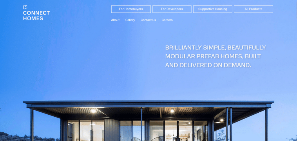
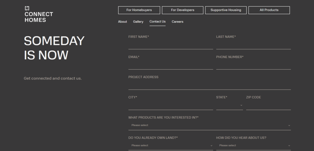
Their classy homepage is reflective of how they are experts in the field of design. Each scroll down from the top leads to a snippet of their brand’s offering. Everything about their content is clean and well-thought of.
Easy location of relevant links is placed for the convenience of the reader. Reaching them is also provided without another extra step, through the open contact form they add towards the end. If the beautiful and sharp design isn’t going to convince you to sign up with them, I don’t know what else will.
MVP Builders
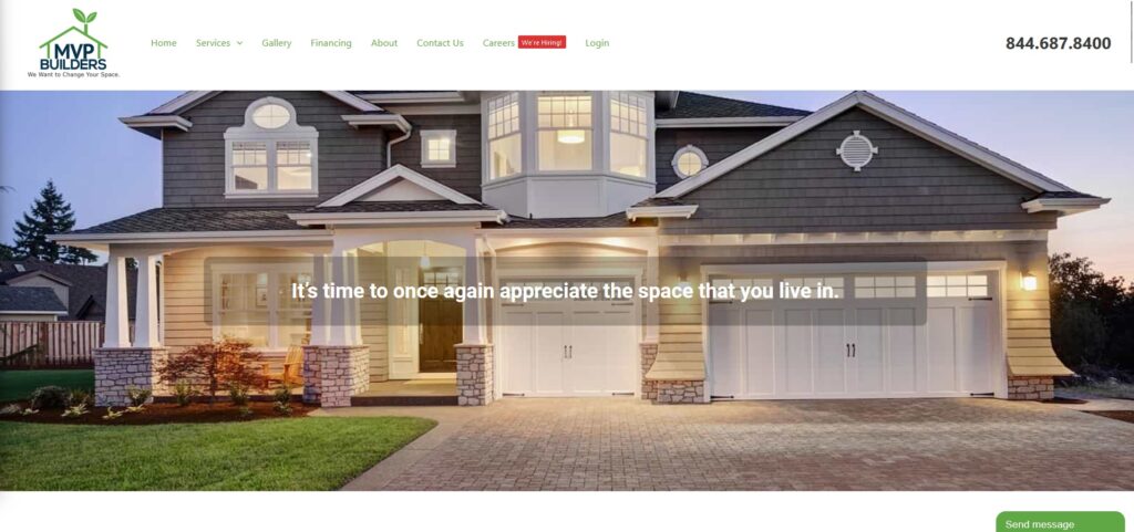
MVP builders arrange their menu options in a clean way that makes navigating their homepage quite easy. Above the fold, they let the reader focus on one key message that drives the nail in marketing!
They have also made contacting very convenient with a rather conspicuous contact number placed just at the upper right corner. If that’s not helpful enough, you got to appreciate their live chat options for easy communication.
Aside from an on-brand overall design, they really think about what the visitors need and even placed an appointment setting module that allows you to book for an appointment while you’re on the homepage. Talk about practical design thinking.
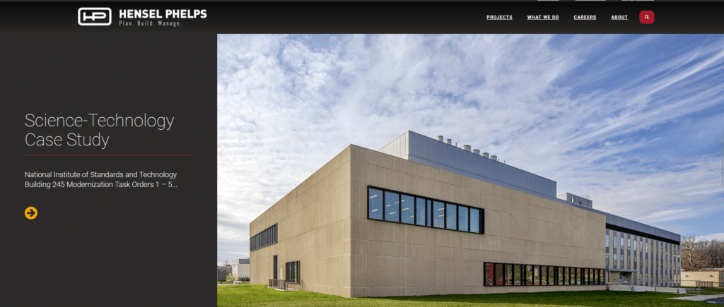
Hensel Phelps
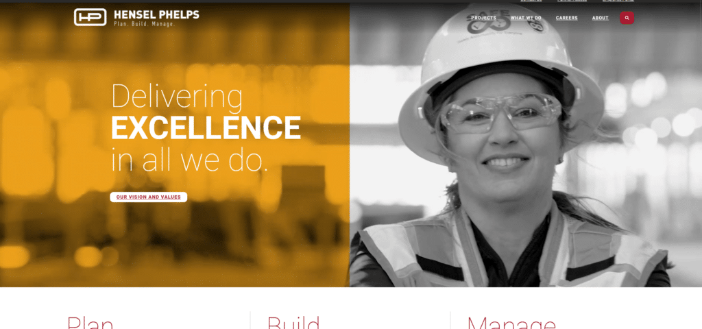
Elements of this website’s homepage fit together to feel like one functional unit. Just like how they would build a structure, small sections are done with great consideration so that they all work together as a greater whole.
What’s extra interesting about this homepage is that instead of providing a portfolio of brands/companies they’ve done work for, they share case studies for readers to check out. Adding something that gives value to your readers increases their likelihood to engage.
In our Xtreme Homepage Makeover Guide we cover on other aspects of homepage design that will encourage readers to stay longer and read more on your website.
Snyder Construction Group
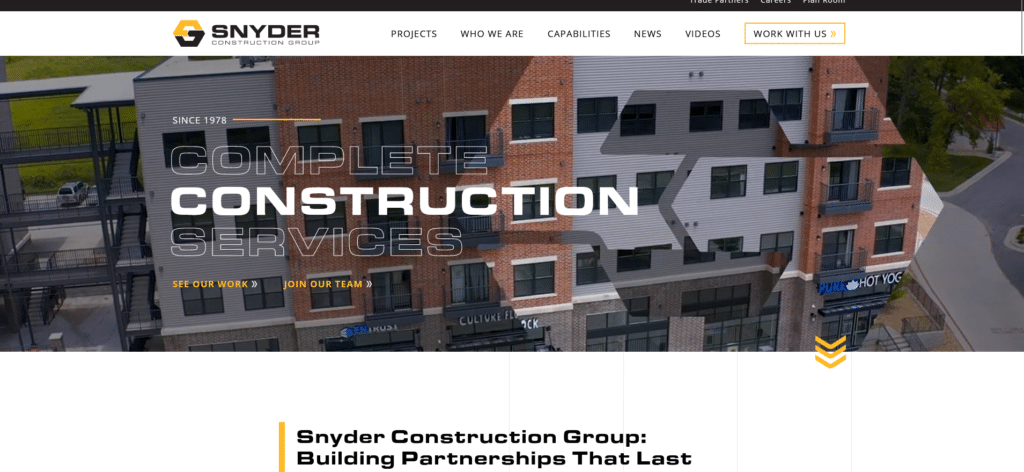

Every company is proud of what they have to offer as well as their identity as a brand. However, the problem with some is that they try to cramp up their homepage with their company information in a way that it feels like you’re reading a thesis defense.
Take this homepage as an example of how to still share a lot of information, but in creatively organized sections that allow people to take one initial look and a more detailed read when they feel like it. Work with formatting and content arrangement to encourage sustained readership.
Belmark & Nightingale
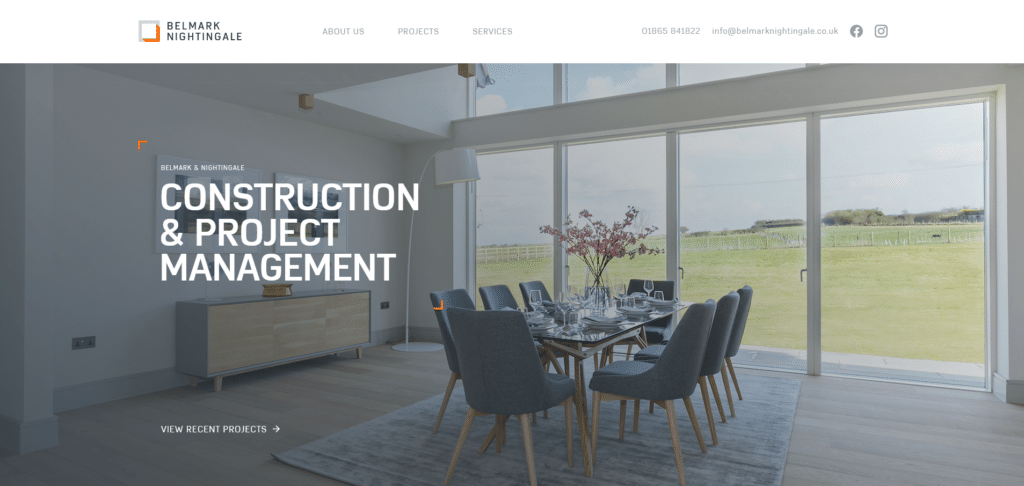
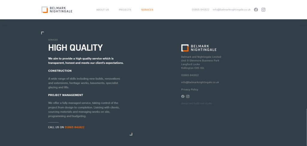
What do you get when you marry a beautiful showroom and website? This homepage by Belmark & Nightingale. Instead of plastering awards from random awarding bodies or doing a lot of self-praise, they confidently show their work on a clean spread above the fold.
Flowing down the homepage we are met with more options of images and categories that we might be interested in. Font choice, formatting, and sectioning of the content makes for an easy read. Ready to work with them? Their contact information is easy to find whether on top or even at the bottom.
Build With Style and Function
Construction companies are expected to blend the two elements together. Environment is extremely influential to human behavior so designing a space requires careful thinking for how people engage with the design. This is also similar with a website’s homepage.
When you design a homepage that is inviting, accommodating, and most importantly helpful, a reader’s browsing experience becomes seamless and smooth. The homepage navigation becomes a positive experience and brand trust is founded on that experience.
Sometimes it’s not really about being very showy or flashy with your homepage design. It’s even something as simple as having a proper contact channel, providing the most commonly search items on the homepage, or arranging your text so it’s easy to read or skim. Customer-first experience brings out the best in every homepage.