5 BAD Examples of Car Company Homepages, Top 3 Are FAMOUS Car Brands!
Discover the key missteps of car company homepages in our latest analysis, a guide to avoiding common pitfalls and enhancing your own website's performance.
You’d think that with all the available information online on how to make a proper website, that you’d see less bad examples of car company homepages and yet here we are. Hopefully by the end of this post you’ll have an idea of why these homepages have made it to this list and actually is helpful for introspection if you’re following their bad practices for your own site.
Now, before I start I want to be fair and say that these homepages (except for one in particular and I’m placing that homepage for last because you save the best worst for last) are not actually super bad. There are just some pretty obvious things they could fix and their homepages will greatly improve.
You see, sometimes it’s not about overhauling an entire website (maybe for the last one) but fixing the little things that truly matter.
Let’s begin!
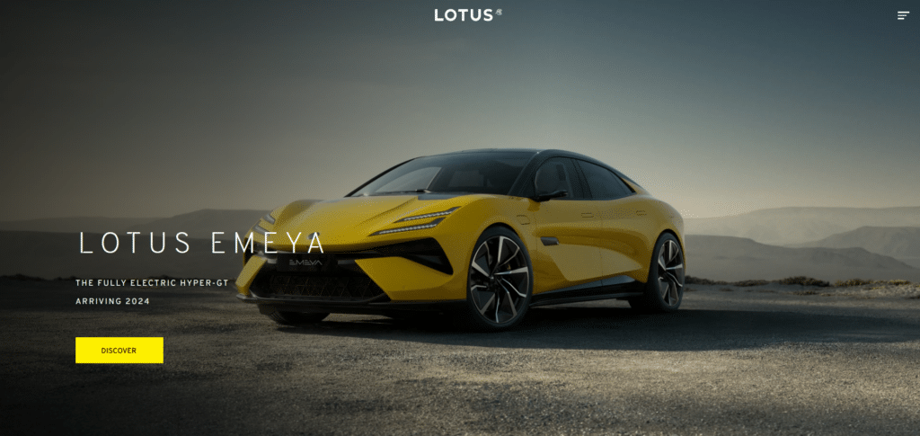
Lotus

If you simply want to build a digital billboard then this car company has definitely done that effectively. But even more popular brands like Benz or Tesla know that having a homepage is not just about showing off their products. It’s also about creating an effective buyer’s journey. That means not oversimplifying the homepage into one digital brochure. Is your contact information easy to access?
Can people learn about your brand right after seeing the homepage? Is there any time-limited offer they can immediately take advantage upon first visit? Simplicity is good but too much of it will kill opportunities for sales.
Bristol Cars

When I saw this homepage I actually wondered if this was the legitimate website of Bristol Cars. Their cars are gorgeous and they are just one of the finest British cars you will ever see. But what’s up with their website? After a few minutes of trying to figure if it is under website maintenance or really just the way it is, I’ve ended up convinced, they really don’t want to show you their cars on their homepage.
Scroll up and down and you WON’T SEE ANY CAR. So yes, maybe they might do something later on with their website but always remember, even when you’re not yet ready to showcase their products for whatever reason, any company website should provide an easy way to be contacted and not hidden in some teeny weeny text that you need scan around for on the website.
Geely

Geely has become more and more popular these days as they take market share across the globe with their interesting electric and hybrid vehicles. As interesting as their cars are, their website though may be lacking in a few things. For starters, can you easily read the text at the top part? For some with sharper vision yes, but the image clashes with the text.
Next, when you scroll down, the elements feel all too aligned to the left. There’s a lack of balance with distribution although its responsiveness is not too bad. There’s again the fault of being “too minimalist”. If I didn’t know Geely already, I wouldn’t know they’re a company known for electric vehicles. This is the terrible problem of “assumption”.
Just because you think you are popular, don’t assume it for your website visitors.
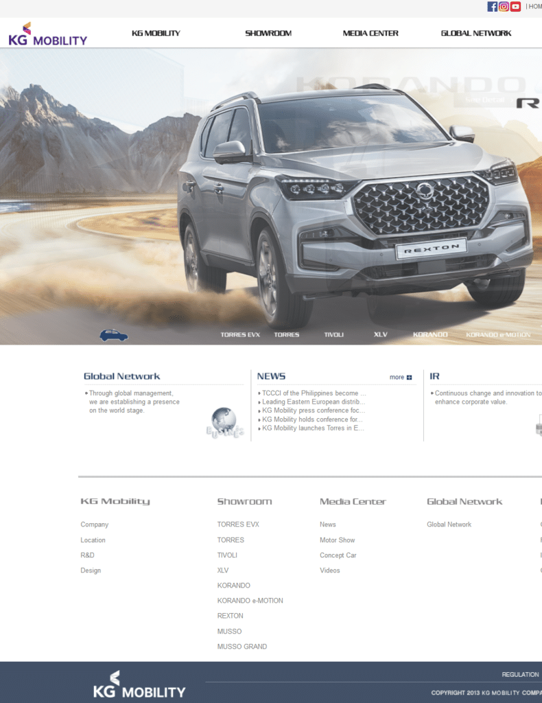
KG Mobility

You’d think with all the available website themes and design with built-in options for mobile responsiveness, you will no longer see pages that don’t adjust to different display sizes. Unfortunately for this company, it’s still a thing. The font sizes are too small for easy reading. There’s a weird “All Menu” that doesn’t really do anything other than drag you down to the end of the page.
The whole homepage experience feels like something that was pulled from 2010. If you’re trying to exude an aura of excellence and quality, this kind of homepage won’t give that impression. For this one you will most likely need a homepage overhaul. But just you wait, this isn’t the worst one yet. Let’s take a trip to the past with the last car company homepage.
Stevens

No https, no mobile responsiveness, overstretched logo (or maybe that really is there logo design?) and a footer with links to different pages but arranged as if they were one long sentence. THIS homepage needs a FULL MAKEOVER. To be fair, there’s some good feeling of nostalgia when I see a website like this. Almost like going back to early 2000s when website builders didn’t have much capability yet.
I’m curious though, is this car company still running? If you own this page maybe you’d be interested for an extreme homepage makeover.
Every Car Has Potential for a Greater Performance
And just like every car has that potential, every website has that potential too. If your homepage is open for changes maybe you’d like to consider learning about best practices for web design so you too can maximize the opportunities for sales. It’s all about fixing the little things so that it all adds up to one nice and smooth ride for the website visitors.


