5 Bad Restaurant Homepages That Will Turn Off Customers
Discover how your restaurant's online presence might be missing the mark and what you can do to turn your homepage into a customer magnet.
The food and beverage is a highly competitive industry. With the rise of digital and social media you already know from an early start if you’re restaurant has the “it” factor or not. If you’re a restaurant that is winning the game offline but struggling online, then maybe there are some changes in your digital real estate that you need to fix to get your visitors converting into diners.
Interestingly, all one needs to do is make sure that the landing page or homepage of their website reflects the great customer service and effective communication a good restaurant already has. Here are some of those restaurants that are definitely needing a homepage makeover so they too can start winning the F&B game in the digital battlefield.
Str-Eatz


If you have been following any of our listicle series about bad homepages, you’ll know how we emphasize that blowing up your logo on your homepage is just not the way to do it. Aside from the fact that the brand name is already a challenge to process (and that’s for another article about branding), the logo takes away the attention from what could have been a better subject: the food image at the background. The color choices are also not appealing and don’t really stimulate a gusto to eat. But of course we want to point a few good things such as having an easy access to information directly as you scroll. This too can also be improved by placing the contact information at the header and offering something enticing like a discount coupon for first time website visitors.
East West Connection

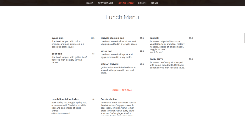
Don’t put your full menu on the homepage. I get it, you want your customers to access your menu through your website and this feels “modern” and “innovative” but there are ways to do it without sacrificing all that beautiful digital real estate space. Your homepage is vital for decision making for a lot of new visitors who have never been to your restaurant. The menu can be another page on its on such as a domainname.com/menu . Don’t force it on your homepage or else you’re losing the chance to simplify communication so that your potential diners can be converted into customers. In the first image you can also see a line of code still lingering. That’s an absolute no-no in design, no hanging code should be seen in your front end.
Hildegard’s

Here’s a great example of a good restaurant but with a bad website homepage. Hildegard’s really hitting it with the great ranking in Trip advisor and almost 5 stars in Google reviews. That would have been a great opportunity to showcase who they are to their customers by showing a carousel of those reviews on the homepage. Instead we’re greeted with an overload of information. It doesn’t help that the homepage design looks like something from the mid-2000s and is clearly not designed for a mobile-first mindset. If you already have your logo on your header you don’t need to repeat your brand name on your banner. Not only is that redundant it also means you miss the chance to claim “Hunstville’s best German restaurant!” on the banner.
Old Green Brier

When building a homepage you always want to focus on what is most important for that homepage. If your focus is to redirect to another website then this homepage is winning in that aspect. Instead of seeing a nice call to action to book/reserve a table, I see instead a big button that leads me to their equipment supplier: Hush Puppy King. When it comes to first look, you can’t help but be overwhelmed with so much to read, there’s a whole article trying to hype themselves up and the links at the header are all over the place with no rhyme or reason as to how they are organized. At one point it’s a welcome page then suddenly it’s Meeting Rooms and then Catering. Shouldn’t these be compiled with Birthdays and Celebrations, and how are Birthdays different from Events? Organization is key so that your reader does not get confused with where to read and what to read.
Salt Lake Chinese Restaurant
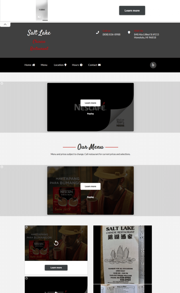
You know we save the last for the best worst homepage in our list. Who places 3rd party ad placements on their company website?? And it’s not even just one ad strategically placed for comfortable and pleasant viewing, it’s spread all over the homepage like a virus during flu season! This is definitely a mortal sin in homepage designing. You only have a few seconds of attention for potential visitors. We know we hate ads and if that’s the first thing they see they will immediately exit and not consider even reading the rest of the homepage content. Even the menu is just a lazy poorly-photographed image of their menu. At least they got right in clearly posting their contact number in the header and making the header links organized.
Remember Your Customer Service Practices
I’ve always thought that restaurants are one of the industries that really cover customer service in a way that’s a tier above other industries. That is because restaurants are all about details in the smallest things. If you work out the little things then the website visitors will see value in using your website the same way they see value in your dining experience. So if you’re curious if you need a homepage makeover maybe you’d like to check out our Homepage Makeover guide.