5 Bank Homepage Designs That Inspires You To Invest
Discover the top bank homepages that blend security, trust, and user-friendly design, making them perfect for digital natives.
If you think about investment and anything that deals with money, there’s a lot of security concerns that revolve around your decision making. Banking is an industry that requires trust and assurance because money is not something that is easily earned.
Especially with so many scams happening nowadays, you would want to make sure that the banking digital portal you are visiting looks legitimate and helpful instead of cluttered and concerning. Here are 5 examples of banks who got their homepage design just right for the willing investor.
Wells Fargo Bank
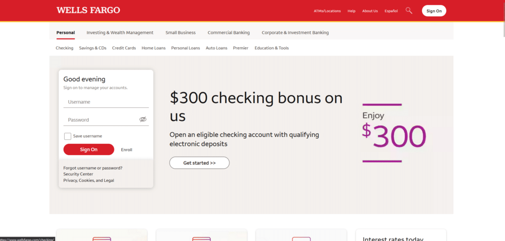
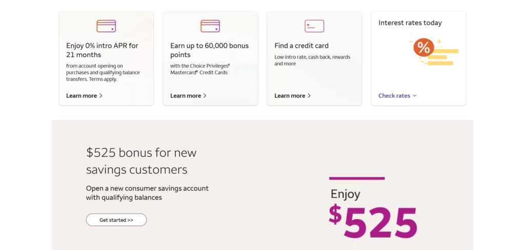
One of the key traits of a very good banking homepage is one that knows how to use opportunistic offers for newcomers on their website. This has got to be a mix of being helpful at the same time sales-driven. Their homepage is doing the selling for them without looking cheap or loud in their approach.
Arranging the offers, the services, and other important information in a clean way, makes reading the interesting offer smooth and unobstructed. If there was too much going on with this page, people might just skip altogether and miss out on reading those great offers.
Santander Bank
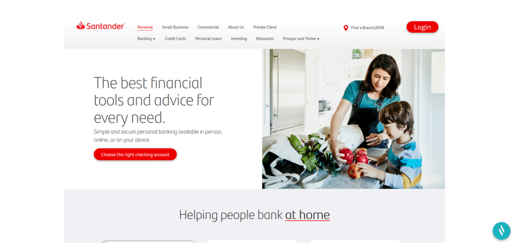
This bank’s clean and professional corporate look won’t have you questioning their credibility. This is what I’m talking about when it comes to design that communicates a certain image to you. When you look this clean and organized, you encourage feelings of trust on your brand.
Easy to digest data, clear call to action buttons, interesting promotions for added engagement, and overall just a value-giving homepage; these are what our Xtreme Homepage Makeover Guide cover on to make a successful homepage.
Seasons Federal Credit Union
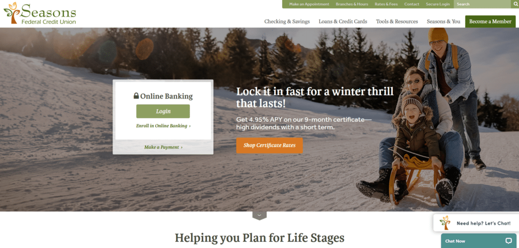

Among the 5 bank homepages, this one had to be my favorite because it really embodies the word “helpful”. Lower right corner you will see a live chat section if you want to know more from this Financial Cooperative. The services they offer are beautifully summarized in visually appealing icons and brief descriptions, completed with very clear call to action buttons.
My browsing experience for this homepage felt relaxed, approachable, and engaging. Banking institutions tend to be intimidating so this one’s more cozy design is reflective of the credit union’s goal of helping individuals.
Webster Bank
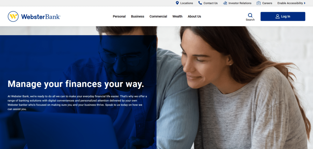
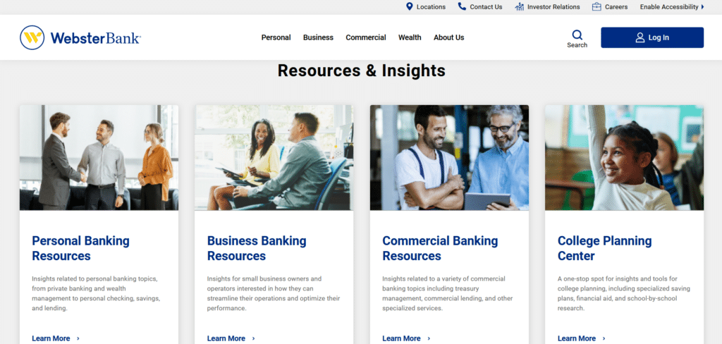
While the aforementioned homepage had a cozy design, this bank is taking similar elements of helpful components but in a more business-professional feel to it. If you notice, all the sections that are necessary for skimming are properly placed so that your eyes know where to look and what to look at.
They resisted overpopulating the homepage with excessive detail about their services and trusted on the reader’s ability to discern which content they want to learn more about. While I have high praises for this homepage, I still will not hesitate to point out that it could be good for them if they had an offer posted to get new visitors to engage with them.
Riverstone Bank
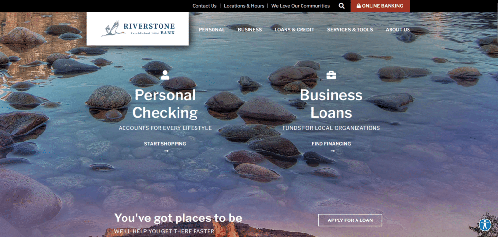
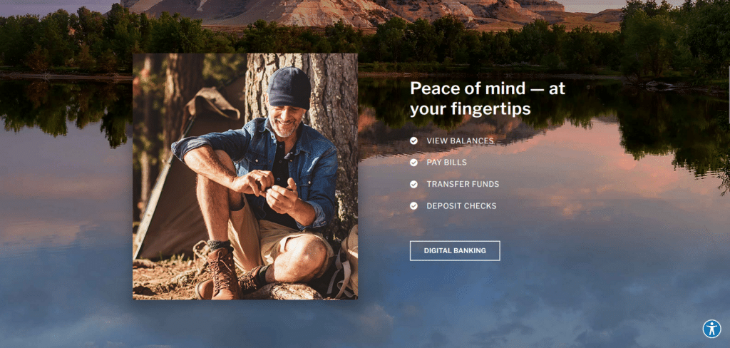
In terms of just beauty, I give this homepage the crown. This was the only banking homepage that really used beautiful imagery to give you this feeling of a journey as you scroll through their page. A continuous background image creates this flow from top to bottom.
Because of how beautiful everything was designed, it didn’t feel like a chore to read through their content. In fact, I WANTED to read on and learn more about what offers they have. The call to action buttons don’t get in the way of the design but it still is clear enough that I won’t miss them out.
Invest In A Homepage That Builds Trust
I remember a time when banks didn’t care so much for how their website should look like because they felt that it wasn’t too important to people. Nowadays the new future depositors and clients are the young generation who are, for most of their lives, online. Digital natives approach websites with a judgemental eye.
Banks that have lasted for several years know all about adaptation and evolution. Making sure their homepage is keeping up with the times they are able to conquer both their presence offline and online.