5 Consultancy Homepages That Are a Masterclass in What Not to Do!
Learn from these missteps in consultancy homepage design, ensuring your website showcases your expertise and professionalism effectively.
It’s sad to say that even a couple of decades after the dawn of the internet, we’re still seeing several consultancy companies stuck in their old homepages or refusing to follow what industry best practices are for homepage design. While it is true that deviating from the norm can sometimes be an advantage but when you fail at something as bad as your digital first impression, then that is concerning.
What aspects of a homepage are we looking at when we say a homepage is just not getting it right? Let’s look into these 5 examples to know more about why these websites even made it to this list.
KS Consultants
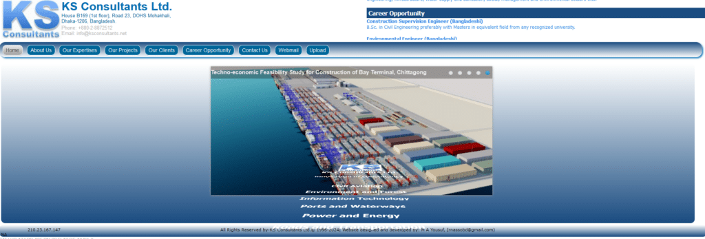
What in the Star Wars is going on with this page? This homepage is great if you were back in the 90s and trying to impress your classmate with your website building assignment but this does not in any way, spell out professionalism and expertise to your potential customer.
There is still a lot of digital real estate that could have been opportunity to showcase past projects or customers and even a small section that talks about why you are the best at what you do. Let go of fancy animations and focus on the important things that help lift up your brand.
Scotsman Consulting Solutions
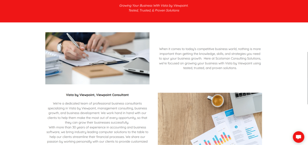
As a website design they’re not too bad. It looks nice and professional. They seem to have a good brand image. Where it lacks however is in vital information that further legitimizes them as a company. Where are they from? Who runs the company? Who have worked with them?
If you are a reader and you don’t really see other information that validates the company, wouldn’t you just skip it altogether? It was effective in communicating their Vista by Viewpoint specialization but it doesn’t really cover any more detail like how they work or how to get started with them.
Death by ambiguity once again.
Mishra and Mishra Consultancy
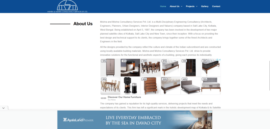
It is a mortal sin for any company homepage, to place a third party ad that anyone outside the company, can control for content. Why place an ad where your competitor can potentially bid for a placement in your homepage? If you are ranking well in Google, you might be losing your potential customers to your competitor!
Aside from the 3rd party ad placement, this homepage feels lazy in the sense that it simply lays out a few information and that’s it, you’re done, you can close the tab. NO! Don’t miss out on call-to-action buttons that encourages your reader to engage with you. Sometimes if you don’t seem interested to engage people, potential customers, will leave.
PSE Consulting Engineers
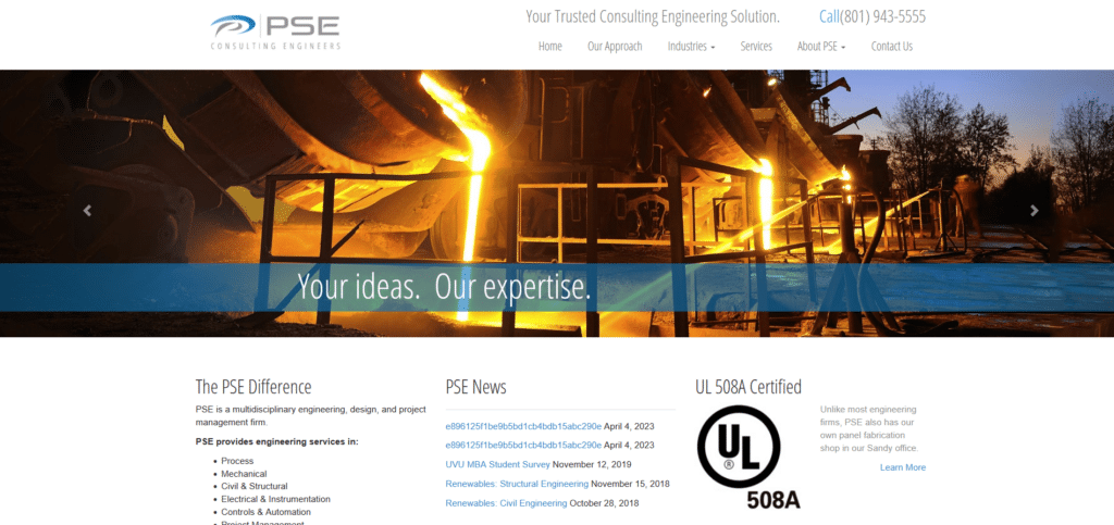
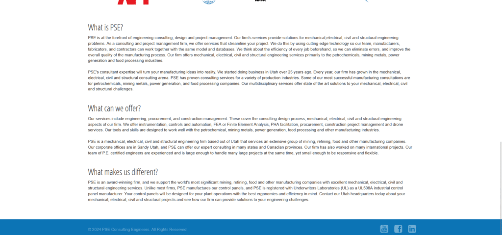
For this homepage I am a little bit more forgiving of what they have done here, mainly because they did make their contact information easy to read. Where I’m a bit concerned though is how they used their above the fold area.
Instead of providing links to news articles, or laying out all those text information in a way that you look like you’re reading a product manual, they could have arranged it all in a flow that is easy to read. Most people going to a homepage initially don’t know what to do. Engineer their experience by arranging your content in a flow instead of just digitizing your company brochure into a website.
ABA Therapy
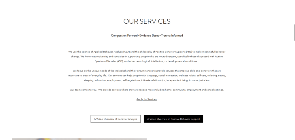
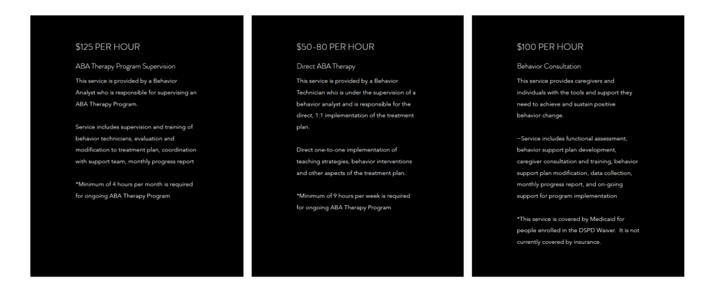
As a behavior expert company, I would’ve expected a bit more consideration for how their website visitors might perceive their content. Now their website doesn’t look bad at all. The calm tones make them as a brand very approachable. Choice of font and colors make them look professional and high up in terms in standards.
However it falls short in the fact that their text, as rich as it is, is just hard to read. For example, their services could’ve been represented with helpful images with list format text. Their pricing? Prices could have been given a different look and the details also listed in bullet form.
Just because something looks nice, doesn’t always mean it is helpful. Always think about how your website visitors will consume your content so you can plan ahead how to make them look.
Project Your Professionalism On Your Page
When building your own website homepage you don’t really need to overthink the experience. Several websites have already used the tried and tested formula for how homepages succeed. We’ve covered vital aspects of what makes a homepage work in our Xtreme Homepage Makeover guide.
And you know, that’s what makes some of these homepages interesting. Some of them don’t actually need a full redesign. They are already on the right track and only doing a few small tweaks can make them a winner in their industry. When you put your customer’s needs first, good things happen to your business. So ask yourself, is your homepage helping your readers or is it busy doing other things instead?


