5 Fitness Homepages That Will Inspire You To Get a Gym Membership
Explore how top fitness brands master homepage design, blending energy, aesthetics, and functionality to drive gym subscriptions.
Early in the year a lot of people are going to be searching for a place to start their fitness journey. Health is wealth and more people than ever, are investing into it. What’s interesting about this lineup that I have compiled is that there’s actually several websites that are a good example. This makes sense because fitness as an industry is highly competitive.
There’s a problem where fitness is the concern and these gyms and fitness brands know exactly how to communicate their offerings. It didn’t take too long to find brands that do well with their homepages and you can tell they’re getting those gym subscriptions and customer acquisitions because they’re following good habits in homepage design.
After all, if you’re a brand that preaches good habits for fitness, same should be said in showcasing their digital real estate right?
Crunch Fitness
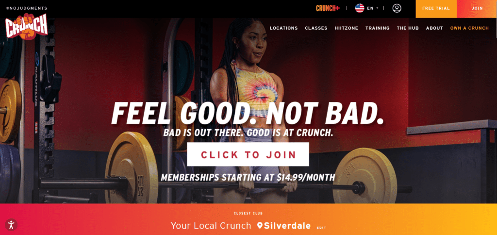
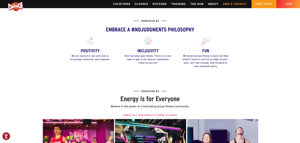
Crunch Fitness has a homepage that screams “Energy!” Even before you go about reading the content, the color choice and placement of elements has this flow that gets you excited and hyped up. The dangerous thing about excessive energy is that it can overwhelm a visitor. Fortunately for Crunch Fitness, they know what they’re doing.
Managing that energy in a way that it is still organized and clean, allows the website both to be exciting and helpful. You don’t feel like the homepage is shouting its brand too loud. It’s not also randomly sharing all their information simultaneously. Reading through the homepage, the information is helpful, exciting, and easy to read.
Big plus for the very conspicuous “Click To Join” button. Signing up for a membership is convenient and encouraging.
Harlem Cycle
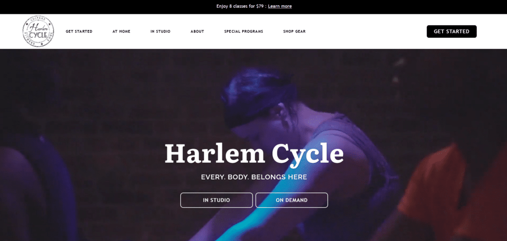
Indoor cycling has caught on in the fitness trend because of the combination of community, music, and an intense guidance from a Cycling coach. I can see what Harlem Cycle is doing here. Clearly a brand that caters to a sophisticated community with a particular taste, Harlem Cycle opted for a more aesthetic approach in their homepage.
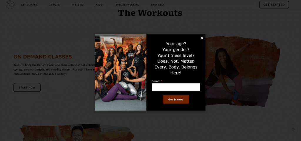
Above the fold you can see they avoid adding clutter and focus on important links that new visitors should click. That doesn’t mean they are not doing any opportunistic sales activity. Cleanly placed at the top ribbon is a value-for-money offer that you cannot miss as soon as you open the page. Scrolling a little bit further you will have a focus item pop up for you to join their newsletter.
A combination of promotion and aesthetics, this is why Harlem Cycle has claimed the flow in creating a beautiful homepage.
Anytime Fitness
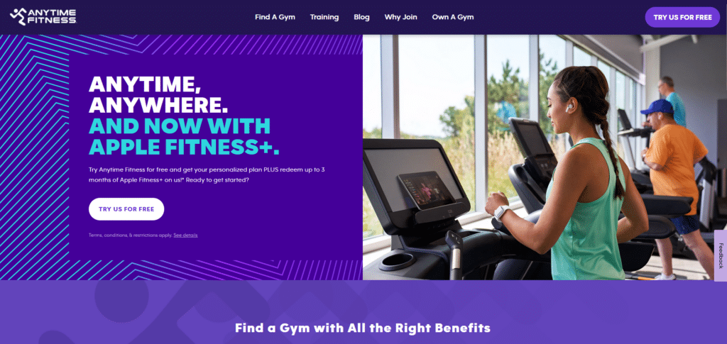
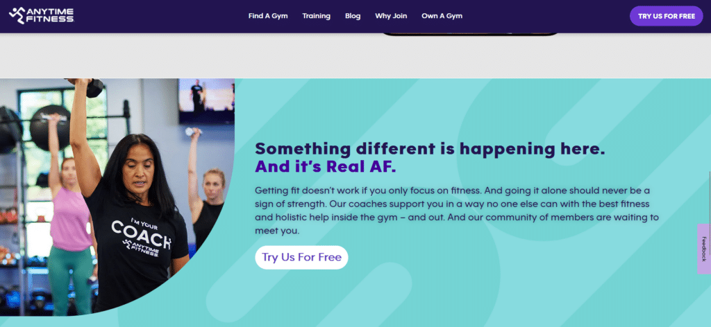
As a global brand, Anytime Fitness carries the burden of expectation to provide professional services and the best quality of gym equipment. This professionalism is also reflects on their homepage. You’d think that because they handle several thousands of branches all over the world, they would have to stuff their homepage. They did not.
Follow the example this homepage shows. Focus on the most important actions you know your visitor needs to do when immediately opening the page. By not overloading the menu bar, your visitor will know exactly what to do or where to go in the page. They also don’t fall short in promotions.
Anytime Fitness is quite known anywhere for their “Free Trial” offering. They know that all they need is just one trial from a visitor and the chances of them getting a membership greatly increases. If you scroll through the homepage you will not miss out on that “Free Trial” call to action placed all over.
TRX
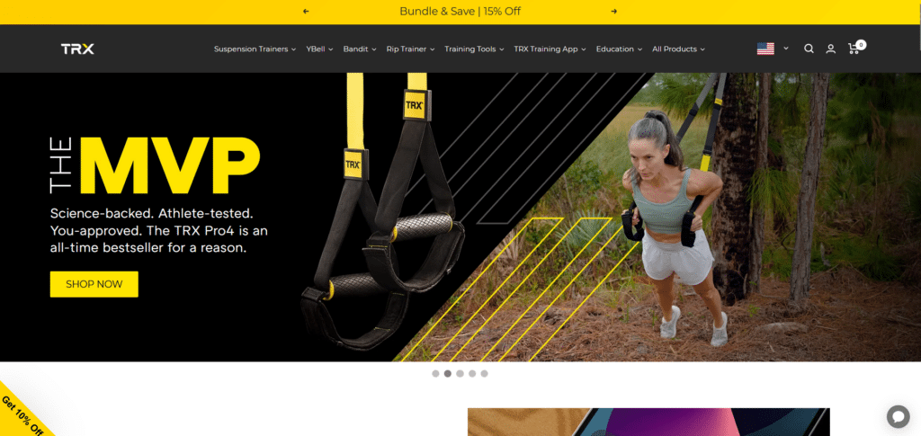
Gyms and fitness subscriptions are not the only ones winning the homepage design race. There are also fitness brands like TRX that have figured out the formula for effective selling of their TRX equipment. Bright yellow and high contrast black defines their brand colors. This consistency can be seen all across the page.
The first part of the homepage, capturing the first look of a visitor, is a banner carousel that provides offer after offer. Whether it’s a subscription, an item, or even events registration, TRX is not afraid to clearly put it out there for the readers.
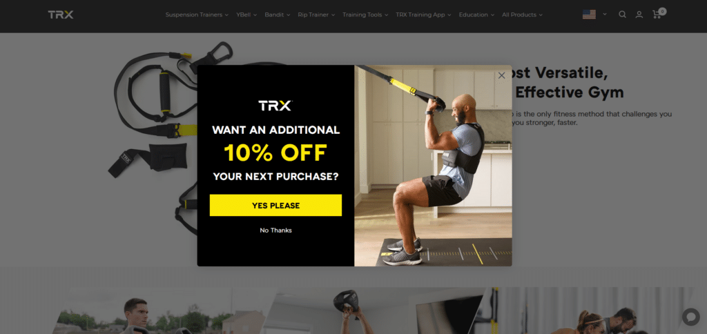
Are they overselling? So long as it is decently done, these “products” are actually helpful especially if the visitor arrived because they are searching for TRX. Bonus points again for a focus item that shows a great offer after scrolling a little bit. This can make a reader feel like they’re already gaining so much and they barely even started.
Life Fitness
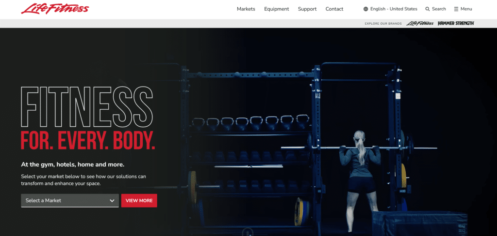

If you’ve been to premium gyms you are more than likely to have seen this brand of gym equipment. With over decades of experience in selling expensive fitness equipment, Life Fitness has refined their selling strategies and that includes their effective homepage.
Because they are a brand that isn’t insecure, they find no need to plaster their logo in an oversized fashion. I can go on about how clean and helpful their homepage is but they’re in this list because of one important element: Customer Reviews.
When people make big decisions it gives them a sense of assurance to know what the experiences of others are. Life Fitness showcases, not only reviews but also the powerful names that provide these personal experiences (e.g. UFC, Anytime Fitness). If the big guys uses their brand, they must be good right?
Good Habits for A Better Homepage
It’s easy to start experiencing success in your website when the most important page (the homepage) is done in a way that shows you are there to help people and not make things complicated for them.
This is probably why several fitness brands are successful with their websites because they understand that just like in fitness, it is the accumulation of several good habits that eventually lead to a big success. Follow their examples and your homepage can come out a champion as well!
Change is scary for some and that might make you wonder how much you’ll need to spend to start fixing your homepage. Thankfully it’s likely that your website just need a few tweaks instead of a full overhaul. Check out our Xtreme Homepage Makeover guide to find out what those few changes are and how they can make your homepage a winner!


