5 Government Homepages that Make You Wonder Where Your Tax Money Is Going
Explore why some government homepages fail in design and functionality, and how these missteps can be corrected for better public service.
The biggest budgets in the world are those of government offices. With budget not being the issue, why is it that we still find websites built like they were simply done by a volunteer who isn’t even too eager to get the job done? Government homepages are supposed to be helpful, that’s the very reason why we end up on their page.
We need homepages that provide us with the information we need without us having to comb through a mountain of text that isn’t always what we need. Sometimes we do see homepages that are trying but trying isn’t enough, there are standards of excellence that are set in the web design industry and yet here we are with 5 homepages that just rejected those standards.
MyNavyHR
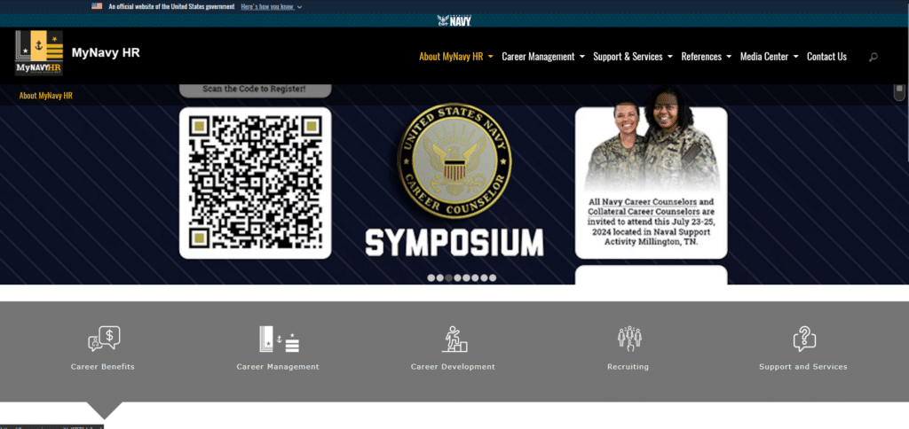
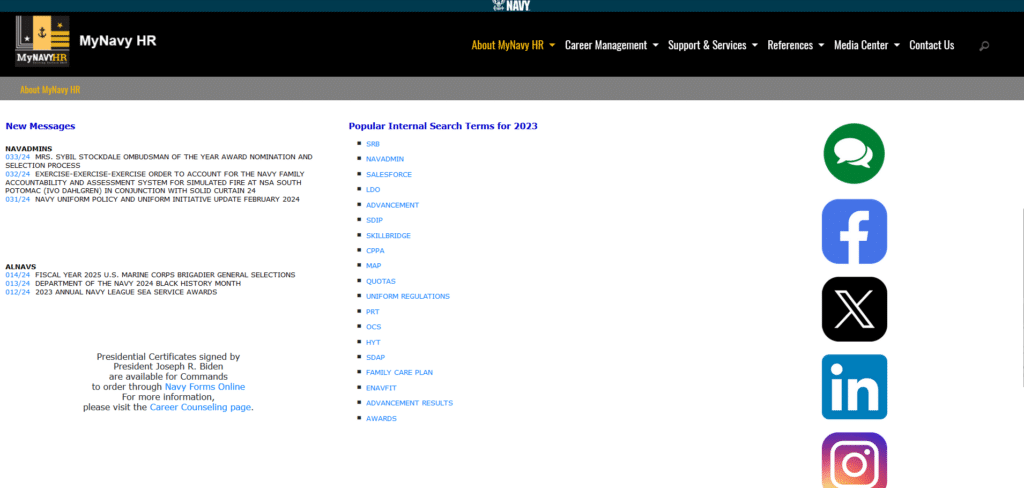
Above the fold this wasn’t too bad. It’s what happens after the initial part of the homepage that makes my head ache. If the objective of this homepage is for recruitment I’m not really seeing anything on homepage that spells out the benefits of enlisting.
I can see this homepage is trying but halfway through it just gives up. Why leave so much white space for what could have been opportunity to tell us more about what great experiences one can have in the navy? For a department that is all about bring out the best of the best, this homepage isn’t consistent with their principles.
Department of Environment and Natural Resources
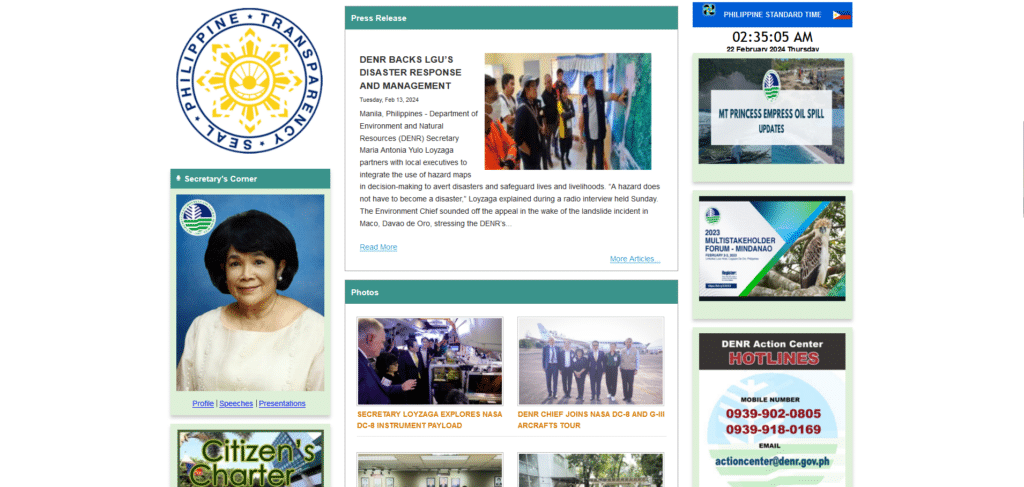
Above the fold, they weren’t too bad. Scroll down a bit more and you’re transported into the early 2000s. Something about their homepage design screams “Friendster” or “Myspace” profile. When you treat a government homepage like a billboard for self-promotion you’re bound to see a bad design.
The only thing remotely helpful in this page is the contact information that’s located on the right column. Everything else doesn’t really guide an visitor to the right channels where they need to process permits or requests.
US Court of Appeals
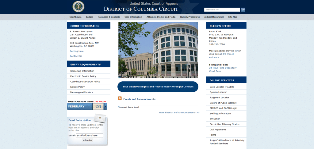
When visiting bad homepage examples it feels like taking a trip to the archives. Homepage designs like this one from the Court of Appeals from the District of Columbia, are clear examples of those who are still stuck in the past. Even if the date tells us it is an active website, somehow they still seem like they’re in the twilight zone.
Not to hate 3-column homepgaes but the reason why we’re going for a more single-flow approach is because we already know how readers behave on a homepage. They go from up to down. Having this 3-in-1 approach discourages further reading. It doesn’t help that they’re also NOT mobile responsive.
Government of Zimbabwe

They say that the homepage of a website is reflective of the intent of the company/organization that had that website built. Above the fold, if your homepage is focused on promoting a certain person rather than the nation that elected him, then you can see what is the implication of this.
A country’s official government homepage is opportunity to show the world what a country has to offer. If it’s poorly visualized with what looks like images taken from a random image library, and also low-resolution cropped photos, then how do you think that reflects on the country’s performance?
There’s no excuse for a poorly done homepage these days. We even have a free guide for Professional tips for Homepage design so there’s really opportunity to improve without having to do a full overhaul of the website.
Kremlin.ru

This homepage had one obvious design flaw that made me wonder if this is actually a legitimate government website from Russia or not. The whole page is pushed far left. Now whether this has any implication to the government itself or not, I will not comment on that.
What I will say is, if you’re designing a homepage for the President, you want to make sure that it exudes excellence so that it reflects the President’s standards. This homepage feels incomplete. There are also no helpful sections that will lead me to other pages that might be relevant and useful for me as a visitor. How to go to Russia’s tourism page? Where can I learn about visiting Russia?
Homepages Are Reflective of the Service You Want To Provide
If you really don’t care about your readers then of course, treat the homepage like your digital billboard where content only you care about, is posted. That’s actually quite easy because no thought is required for posting useless information.
However if you goal is truly public service, you will want to get feedback from your citizens and find out more about what information matters to them so that these will have first priority placement on the homepage instead of an unnecessary oversized photo of a government employee.
Public service starts with the little things that ultimately sum up to a better experience for every citizen in the digital space.