5 Healthcare Homepages That Make You Think Twice About Scheduling an Appointment
Explore how the design and usability of healthcare homepages can impact patient trust and engagement, and learn key strategies for improvement.
Choosing the right healthcare provider is one of the most critical decisions anyone can make, not just for the sake of immediate care but for long-term health and well-being. With the vast array of options available, the journey often begins online, where a healthcare provider’s homepage serves as the front door to their practice.
But what happens when a homepage leaves you hesitating to take the next step? A confusing layout, lack of clear information, or an unwelcoming vibe can all be red flags that make you think twice about scheduling an appointment. In this exploration, we dive into five healthcare homepages that, despite belonging to reputable institutions, might inadvertently prompt visitors to pause and reconsider their choice.
St. Joseph’s Health
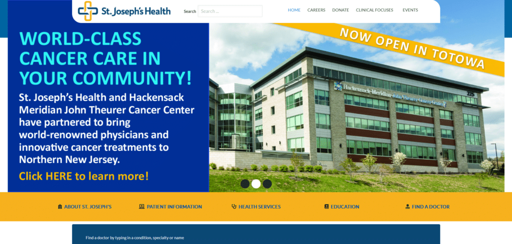

It is important in design, that you cover all bases to ensure that your homepage has a final look that inspires trust instead of hesitation. Unfortunately for this homepage, although not entirely bad, lacked in some important areas.
For one thing, the whole banner is clickable. Even if there’s a text that says “click here” it doesn’t look like a button that can be clicked (because it isn’t!) The helpful links just beneath the hero have very tiny icons that are not easy to distinguish and the links aren’t designed to encourage clicking.
This homepage doesn’t really need a full rework but a correction of some mistakes can change that potential patient hesitation to patient trust upon first impression.
Penn Medicine
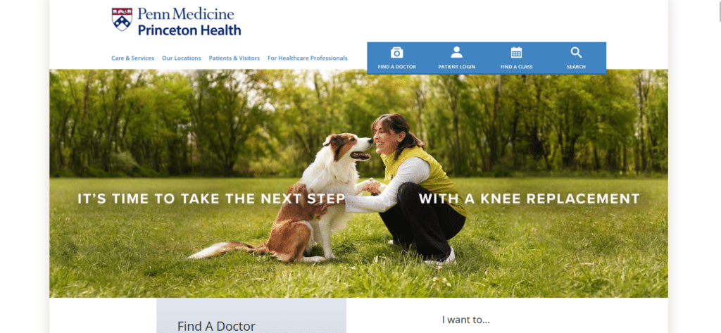
90% of this homepage is just full-sized images that do not help in making a visitor’s experience meaningful. Even if they have multiple call to action buttons or links, it’s difficult to get to them because of how the images have taken over the homepage!
They lack a prominent contact form or search form which is what patients typically look for on a hospital’s website. As a healthcare provider, they should utilize solution-based language to address patient needs more directly. This is but another case of: “if they fix these little things, it could get a whole lot better.”
Corewell Health

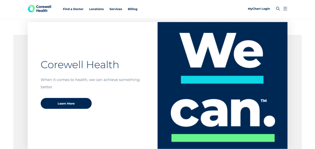
Apart from a homepage design guide this healthcare website needs a lesson on rebranding. I understand that they need to inform their visitors of the rebranding that they are doing, but using the whole hero for that purpose takes away the focus on what they do as a healthcare provider.
What they could have done instead for their hero, is a helpful contact form or general information that is of value to their visitors. What we are seeing however, are blown up sections like this image of “We can.” that does not offer anything helpful to the readers.
Further optimization, resizing, and arranging can change this website from an oversized brochure to a valuable homepage for future clients.
Russel Medical
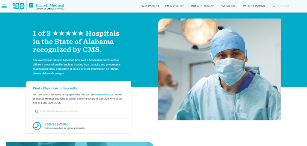
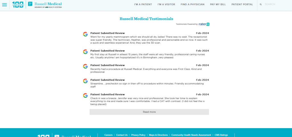
As a homepage we can see they are really trying their best to incorporate important elements which we discuss in our Xtreme Homepage Makeover Guide (you can download this guide for free!) Contact information is clear, simplified selection of helpful links at the menu bar, and even a patients review section.
However, they rather lack in the placement of clear call to actions. The mid section of the homepage is also uncoordinated (or broken?) and the font size makes for difficult skimming for the new visitor. There’s still opportunity to streamline the user’s journey for key information.
Even the review section could be redesigned to fit as a carousel instead of taking up more digital real estate than necessary.
Clay County Hospital
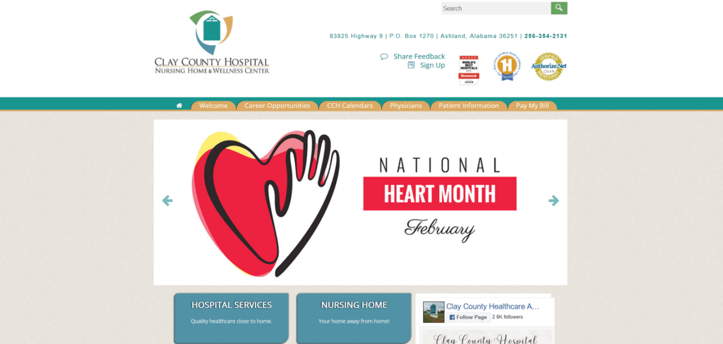
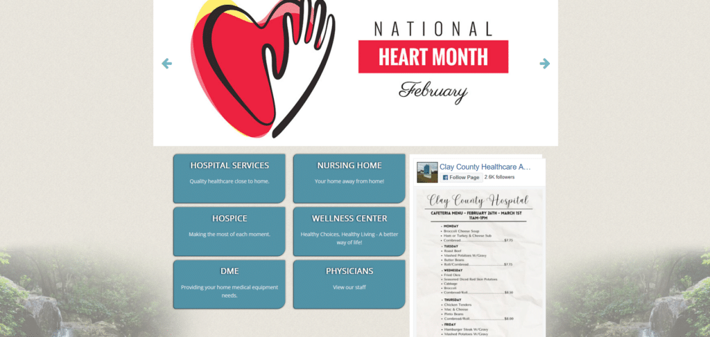
As a hospital, you need to give the impression that your technology used is the most up to date so your patients don’t feel uneasy about their treatment. Being updated then therefore should reflect on your brand image especially on your homepage.
While some may argue that this is a clean layout, it misses out on potential engagement with new visitors because of the lack of options to do so on the homepage. There could have been sections for scheduling an appointment, summary explanations of their services, contact forms for easy reach and even patient testimonials to foster trust!
Empathize with what patients and their digital journey so you know exactly what information to upload. Otherwise having a digital presence and settling for the bare minimum might not look too good for your brand of healthcare.
The Perfect Homepage Exudes Trust and Empathy
The homepages we’ve explored offer valuable lessons in the importance of design, clarity, and user engagement. By addressing the identified shortcomings, healthcare providers can transform their online presence into a beacon of trust and professionalism.
This shift not only enhances the patient’s journey from the first click but solidifies the provider’s reputation in an increasingly digital world. As healthcare continues to embrace the digital age, let these examples serve as a reminder of the critical role a well-crafted homepage plays in connecting patients with the care they seek.


