5 Hotel Homepages That Make You Book Other Hotels Instead
Transform your hotel's online presence with effective homepage design strategies that put customer needs first and drive more bookings.
Even with all the excellent customer service hotels practice in their own premises, you will find that for some hoteliers, that quality experience is only limited within their real estate. Somehow, even in 2024 we still see some hotels that fail in extending that customer-first mindset in their digital space.
There are those who might scoff at the idea of taking hotel websites seriously because there are booking platforms like Booking and Agoda where potential guests are browsing. What others might not know is that hotel homepages are opportunities to legitimize a business in the eyes of a new visitor.
What considerations should hotels take in designing a homepage? What mistakes should they avoid so they don’t miss out on potential bookings?
InterContinental Minneapolis
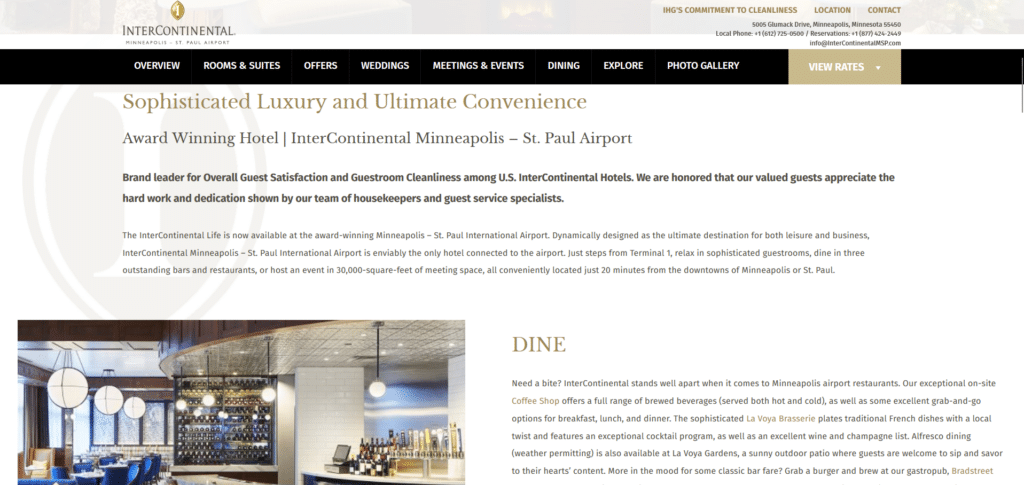
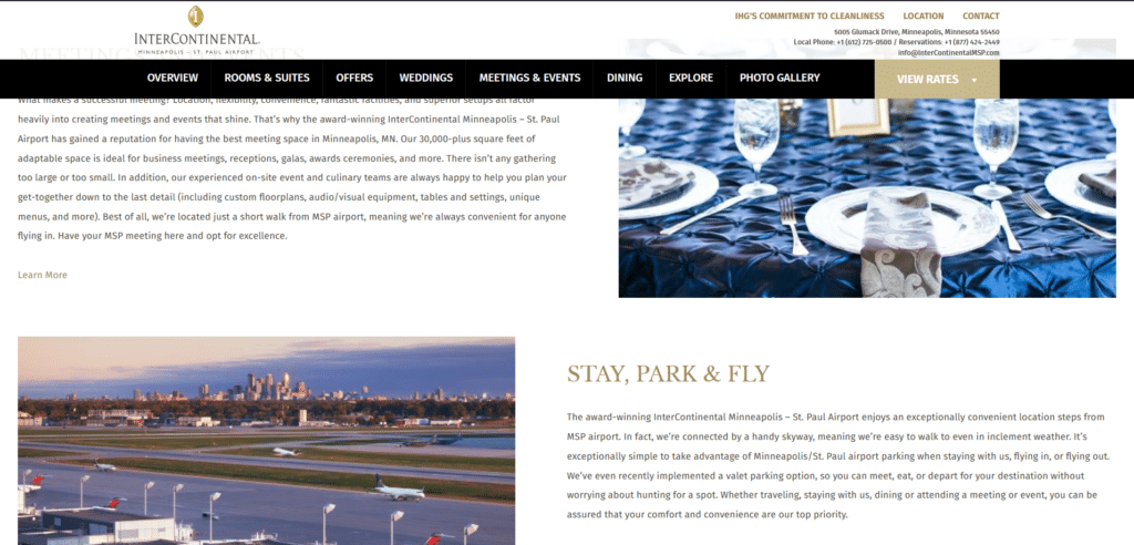
Upon first loading of the homepage it looked okay covering important key information above the fold. A large spread out on the hero shows what the hotel looks like inside. Where it gets difficult for the reader is immediately below the hero banner.
Rows and rows of several text that a reader has to go through just goes on and on. Nobody has time to read detailed information unless they are searching for that exact information. This is missed opportunity to talk about limited offers or anything to encourage a user to waste no time in booking a room.
Antlers Inn Utah
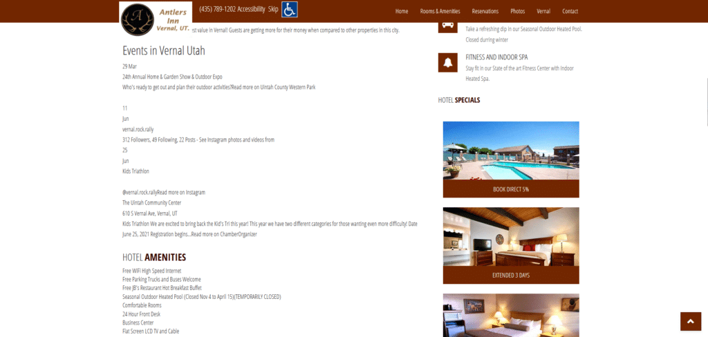

The homepage is not the fanciest in terms of design and sometimes this is forgivable because some readers are just looking for basic information such as contact number, other guest reviews, and room details. But how can you find all that necessary information if your text are difficult to read, excessively long, and just irrelevant to what you need to know?
All that digital real estate being filled up with text is missed opportunity to place eye-catching offers or promos that will get guests making reservations without hesitation. Font size and font type is also important if you want the reading experience to be comfortable especially in a mobile-first world.
The Wolf Hotel

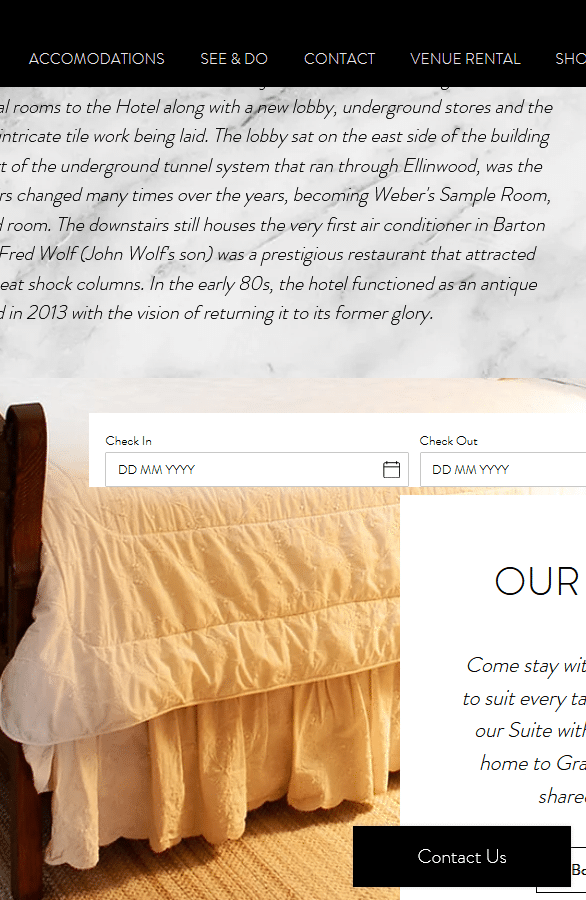
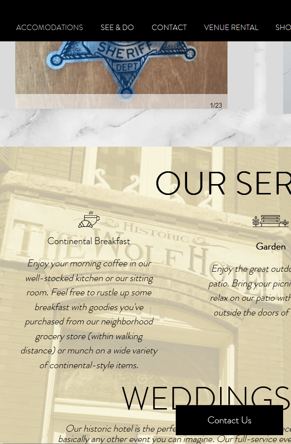
More than half of a website’s traffic is from mobile users. That would mean as a hotel you have to ask yourself, how easy are you making it for people to read through your homepage when someone’s reading it on their phone?
And if you know they are reading it on their phone expect that they are most likely not looking for a reading material that they need to go through for several minutes. Travel planning requires decisive action and delaying important information does not help a hotel.
Washington School House Hotel

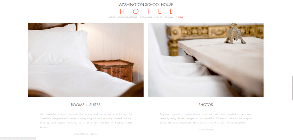
Is this an art gallery or a hotel? The owners must be proud of that question but that’s probably going to be the kind of question that will let them miss out on potential guests. It’s a pretty standard practice for hotel homepages to have an option to check availability right above the fold.
This is a classic example of how the artistry gets in the way of functionality. They’re focusing too much on looking “aesthetic” that they fall short on trying to provide a better browsing experience for their future guests. There are no call to action buttons, nothing enticing to make a reservation. With text that small I almost feel like I’m doing an eye exam in the doctor’s office.
Finding the contact number/address also feels like a page off “Where’s Waldo”. Don’t make it any harder for your guests!
Budget Motel Delta
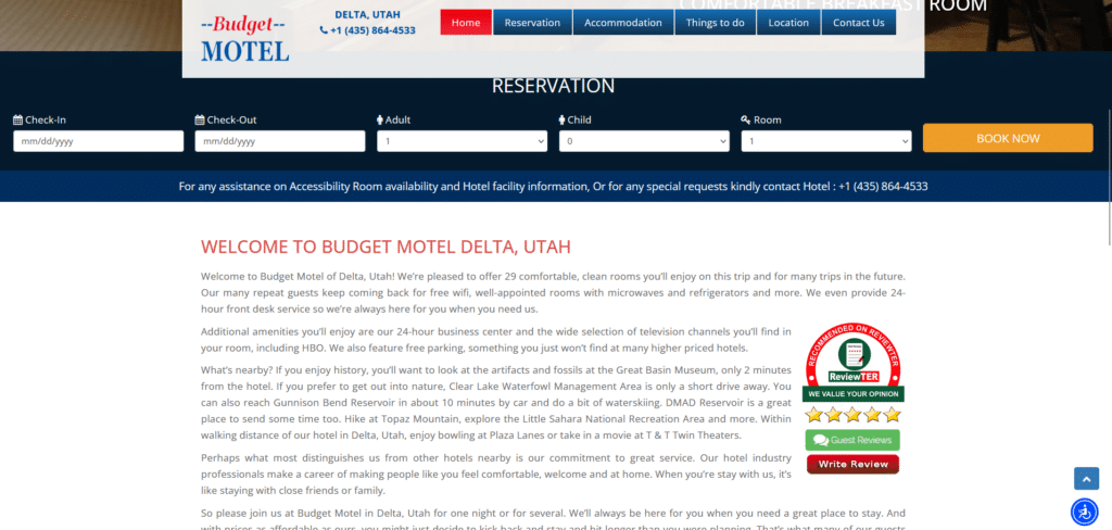
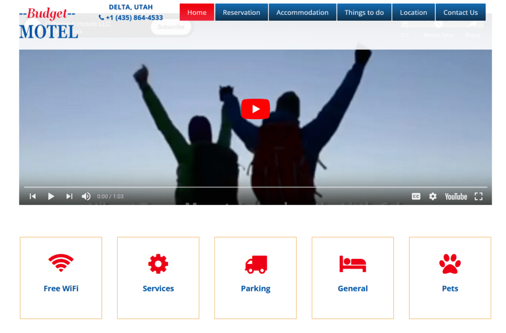
Again with the excessively long text that no one’s reading. As a budget motel, your job is to focus on informing vital information such as check-in and check-out time, restrictions, amenities and other things people will want to know about what your motel provides. \
Half of this homepage is filled with text that people are not likely to read or even skim and a video which less than 600 people have watched in the last 5 years! They may have gotten important things like the reservation form and blocks of key information right under the video but the blocks are not clickable to learn more about them! Are pets allowed? What kind and how many? What services do they offer?
It’s Not About You, It’s About Your Customers
Focusing on your customers has been proven to yield positive returns so why choose to focus on unrestrained self-promotion? Most of these websites are so keen on showing what awards and recognition instead of showing reviews from real people who have stayed with them. (are these award-giving institutions even legit?)
When you apply your customer-first mindset in your homepages you will begin to think “okay how do I make the visiting experience on my homepage seamless and convenient for a newcomer?” Following that kind of mindset you can see that there are just a few things most of the websites need to fix so they can get even more bookings than they have.
Our Xtreme homepage makeover guide cover 12 key changes that you can make on your homepage without completely overhauling your website. You’ll be surprised how big a potential number of guests you are missing out on by not doing these changes.


