5 Landscaping Company Homepage Designs That Make You Dream of Paradise!
Discover how these 5 landscaping company homepages captivate visitors with easy navigation, and engaging content, inspiring more bookings.
Sometimes it’s regulations of the city to keep your front yard up to code, or you’re looking for a beautiful landscape design that will complement your home. It’s always a matter of personal choice on who to do such a tremendous task.
Maybe somehow you’ve thought about getting a professional but you know this involves proper work for it to turn out good. So you’re browsing online for your options. Don’t you find yourself moved to click on those links of landscapers who showcase their good work?
Here are 5 examples of those landscaping company homepages who easily get new visitors clicking on their pages and booking them for an appointment.
Green Options
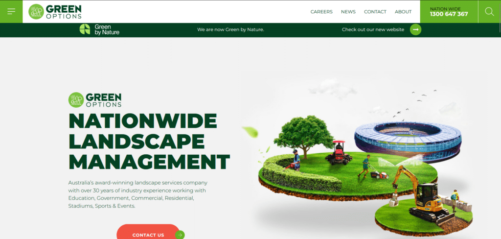
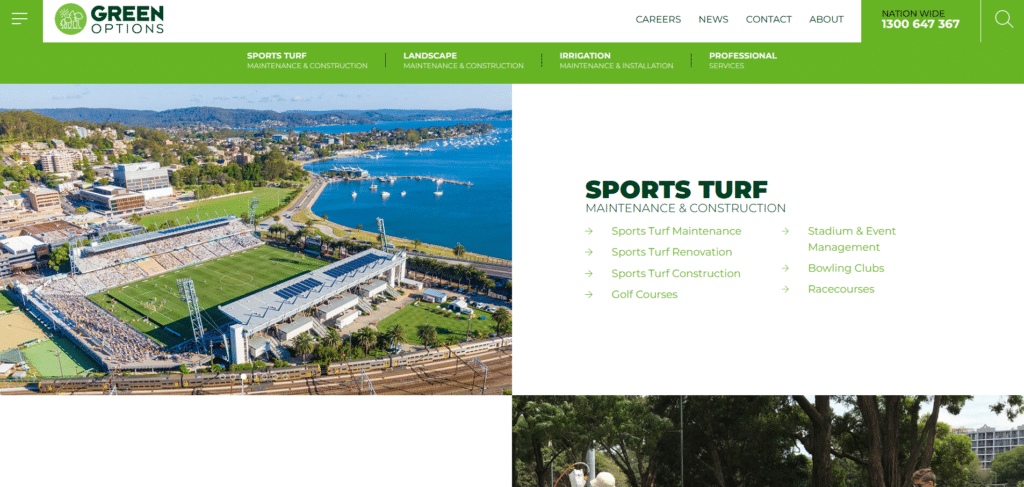
Stunning visuals, actual pictures, clear call to action buttons (colored in a different color to really stand out) and information that is easy to read. They really figured out what people might be looking for when searching for landscaping services.
Instead of proclaiming how great they are as a company, they instead offer helpful information clearly saying “we know what you’re wondering about, here’s something to help you understand.” Homepage designs like this will either get that visitor calling (that very easy to find contact number) or sending a message at the their contact page.
Minnesota Landscapes
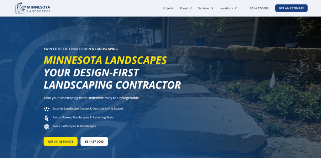
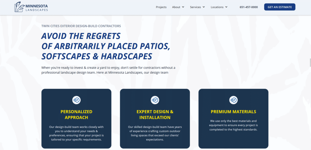
This landscape company really took advantage of their homepage real estate. Look at how they use up every space efficiently with their beautiful landscape images. They do have a lot to say compared to the first one but really it’s all about formatting.
Take a look at how they use headings and subheadings, color differentiation, breaking down of content so all in all it still looks easy to read even if there’s a lot going on. These landscapers also know that most clients are more likely to call on phone so they made sure their contact numbers are VERY visible.
Livewell Outdoors
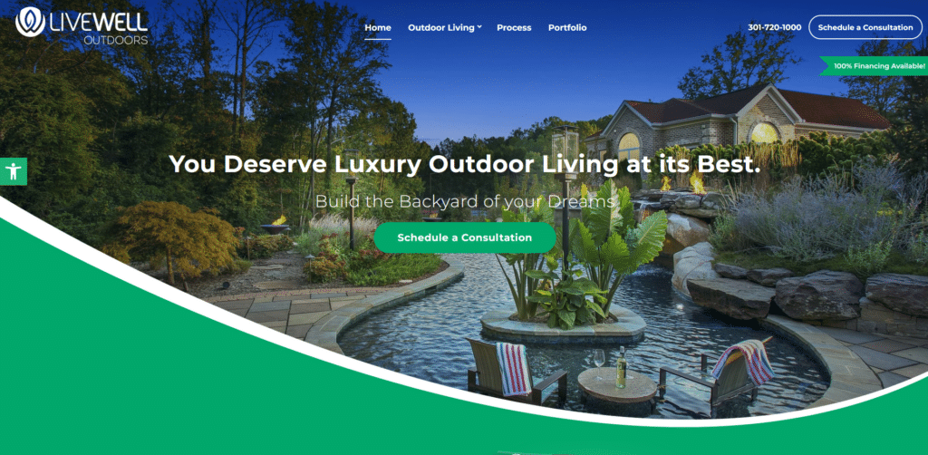
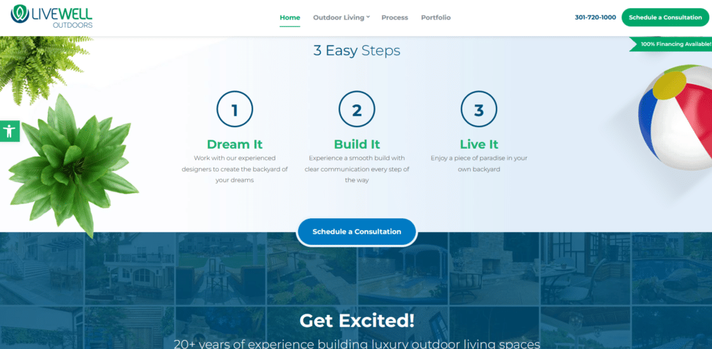
I really love website themes like this. The homepage has this flow and continuity from one section to the other so you don’t simply stop and end your browsing, you have to see it through! The browsing is also guided with several buttons you can easily click when you feel like engaging.
They’ve also made it extra interesting with their “100% financing available!” which may seem small but actually is something that will get a new visitor curious enough to engage and inquire about. For this company it’s not just about looking pretty, but having a homepage design that works in their favor.
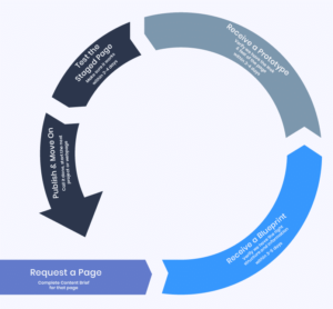
How does one come up with a homepage like this? We have an easy to follow guide: Xtreme homepage makeover that will tell you how you too can make your own homepage as good as these.
Mulkern Landscaping
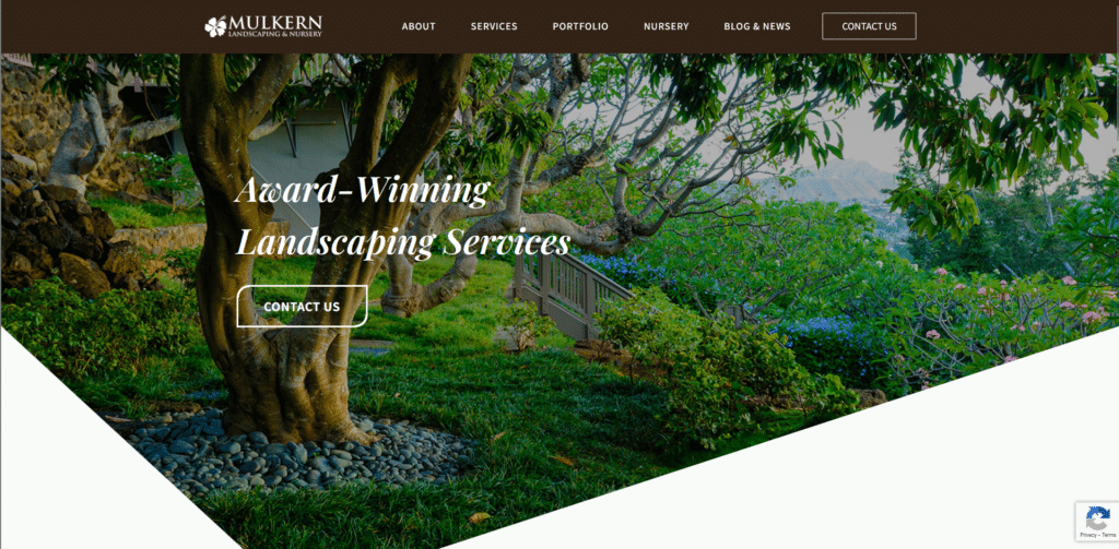
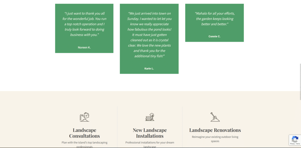
The other landscaping homepages emphasized special offers and services. This homepage that looks like it was pulled out from a beautiful classical library, did not forget to put an important element: customer testimonials.
Never underestimate the convincing powers of social validation. Humans seek other human opinions. We feel better about a decision when we know others have tried it themselves. It is in our nature.
Candide Contractor
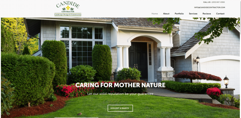
This last example follows a more clean and conservative approach. But even doing so they have not forgotten important elements such as the call to action buttons and the visible contact information. Essentially they don’t want to make it complicated for the reader.
People will see what they offer and they’re very direct to the point about it. So people who take a quick glimpse can decide right then and there if they want to request for a quote or not.
Designing For A Better Experience
That’s what your garden or lawn essentially is, it is an experience. When you look out from the window you want to be greeted with a visually pleasing environment. That’s the kind of visual experience you want to provide for your website visitors.
If you already start off with a bad image through a homepage that is difficult to navigate and not very pleasing to the eyes, then it’s not going to encourage more bookings. More than just looking pretty it also has to be useful to the visitor or they might even end up closing the page instead.
Design your homepages with the user in mind and you will see your business grow.