5 Logistics Company Homepages That Make You Believe In Their Efficiency
Discover top logistics homepages that showcase industry-leading efficiency, precision, and reliability in a compelling digital format.
When it comes to delivery, shipping, and logistics, efficiency is key to getting results for happy customers. Time is an important currency and the faster you get things done, the better the service is for your clients. For this industry we need to find that efficiency in the homepages of these companies to give the impression that their shipping needs will be handled with the same optimized performance.
These are not just web pages; they are digital representations of precision, reliability, and speed. If you can get it right on your homepage, one of the first places where your clients will get to know you, it just might give the right impression early on.
Southern California Warehousing
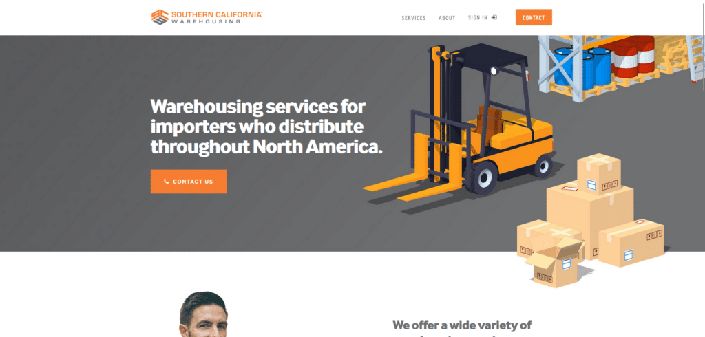
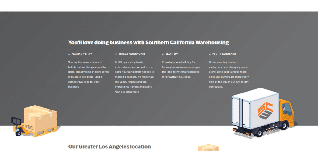
Don’t you just love a homepage without clutter? Almost as if this company is saying “we know organization and we know optimization!” The content on the top section is curated and direct to the point. Early on you are already led to an engagement through their “Contact Us” call to action.
There is no complication of the services as they state exactly what they do and where they do it. Opening their homepage on a phone you can see that they are mobile responsive. Because the content is brief, the reading experience is easy on the phone.
American Metal Solutions
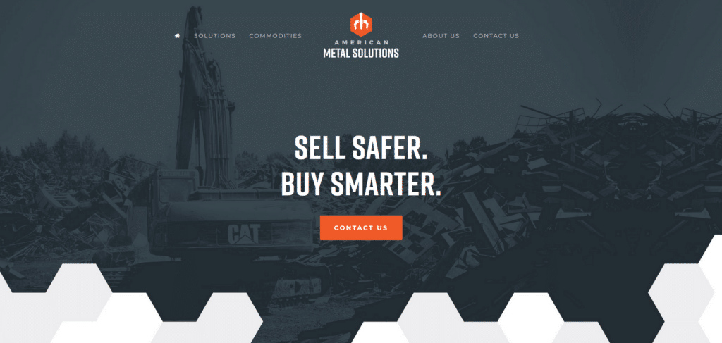
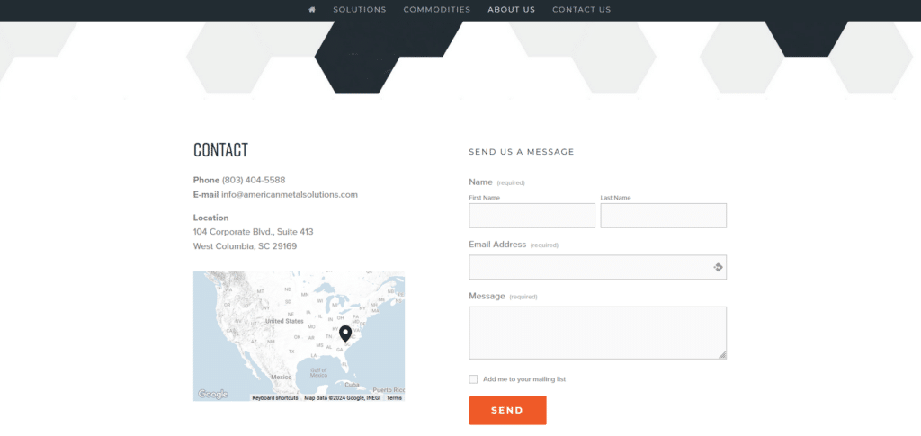
I mention a lot about homepages having a sense of flow when you navigate them. For this homepage you can see that each section is separated AND connected by their honeycomb shapes. There’s this continuity and direction as you read through each section.
Honeycomb reminds me of bees and bees are animals that represent hard work and effective team collaboration. They’ve also made it easy to communicate with them through their contact form just conveniently embedded near the end of the homepage. 5 stars for this homepage!
UPS
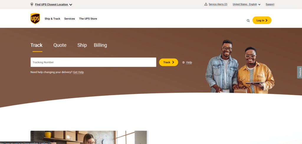
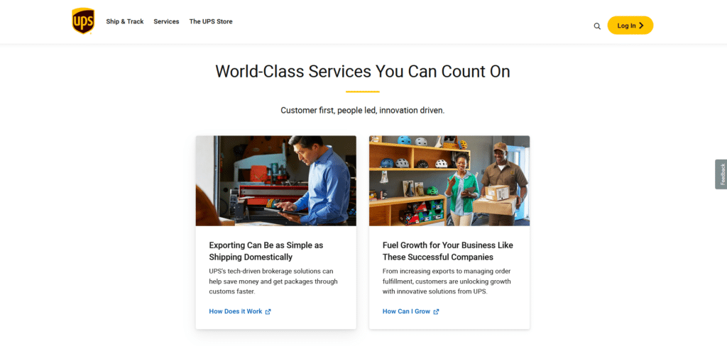
You can love them or you can hate them, but you gotta admit that is one well-thought homepage design. They have been in this industry for more than a hundred years and the acknowledge that everyone’s online these days.
Their experience with dealing with customer needs have led them to select each pathway for the readers on their homepage. I cannot say if their delivery service is as efficient as their homepage but they sure do give me that good first impression.
DHL
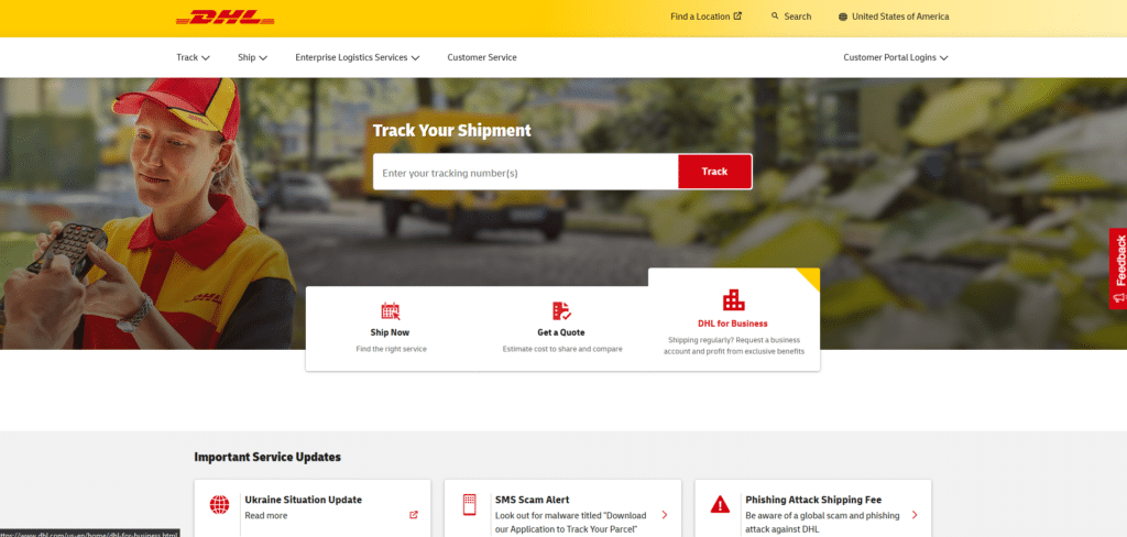
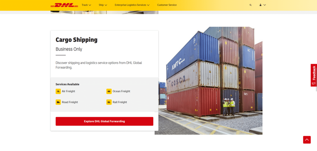
DHL is another globally-renowned logistics company with several services offered. When a company has a lot to offer, there’s a tendency to put it all at once on the homepage. DHL almost did that but they did something different: organization.
Take all that you need to share about what your company does and organize it in a way that if someone is browsing, the content is easy to read. Use list format, categorize the text, utilize formatting of titles and subtitles, and use icons or images.
Launch Fulfillment
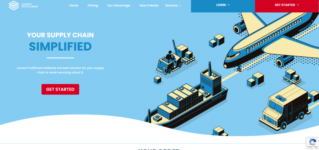

The striking graphic art they use to tell the reader about what they do, is engaging and entertaining. Instead of feeling like I’m reading a brochure about a company, I feel like I’m reading a comic strip that’s educational.
Call to action buttons, easy to find contact information, customer review carousels; they really took all the good practices that we emphasize in the Xtreme Homepage Makeover Guide. If great companies do these small good practices on their homepage (which are easy to do by the way) why shouldn’t you do it for yours?
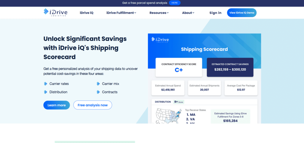
iDrive Logistics
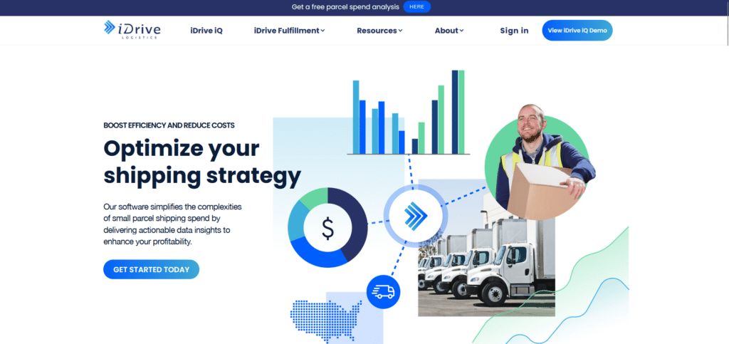
iDrive logistics really knows what it’s like to reel in customers quickly. You can tell by how strategically they’re offering something helpful, FREE, and valuable to their visitors. If you’re thinking of getting some work done, a FREE quote or analysis would be helpful right?
Some companies tend to take offering little FREE things on their homepage, for granted. It’s an opportunity to drive readers into engaging with the page because people love free stuff! When designing a homepage you want to think of “what gets my readers clicking on my links?”
Optimize Your Homepage The Way You Optimize Your Operations
Looking through these 5 examples you get a better picture of a well-optimized homepage that is more than just for online presence. From Southern California Warehousing’s clutter-free design to iDrive Logistics’ enticing free offerings, these companies demonstrate how integrating key elements like clear navigation, responsive design, and engaging content can create a compelling online experience.
Just as these firms master the art of logistics, their homepages master the art of making a powerful first impression, proving that the meticulous attention to detail in their operations extends to their digital doorstep. Embody the essence of your service and you can be recognized for the excellence your company is known for.


