5 Manufacturing Company Homepage Designs That Need Re-Manufacturing (The Last One’s Unbelievably Hilarious)
Discover crucial insights on B2B website design flaws from manufacturing companies, emphasizing the importance of client engagement.
If you’re trying to project an image of a company that upholds standards of excellence in operations and production, then how can you be convincing if your own website doesn’t reflect that image? It’s important to give a good first impression because b2b websites target a very specific clientele.
Manufacturing companies handle large projects and that means they need to be on top of their operations. If they can’t even get it right on their homepage design, it’s concerning to think in what other aspects will they also fail at.
Keep reading this list because the last one, I can’t believe their website is still up and running.
Howmet Aerospace
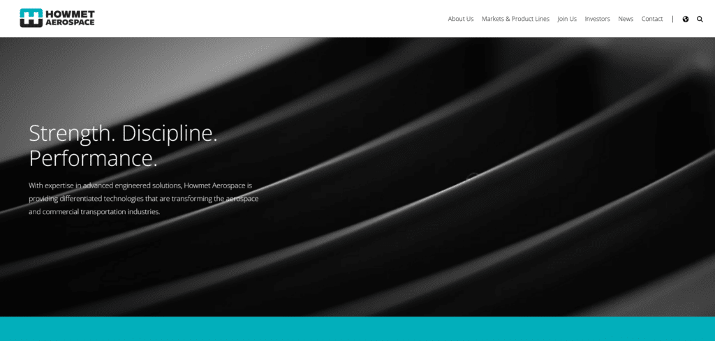
For our first example we have a homepage that’s not necessarily ugly but fails to provide helpful functions that encourage engagement. To start with their above the fold has this video of zoomed in parts. That’s so much first page space that’s missed out on telling the reader who the company is.
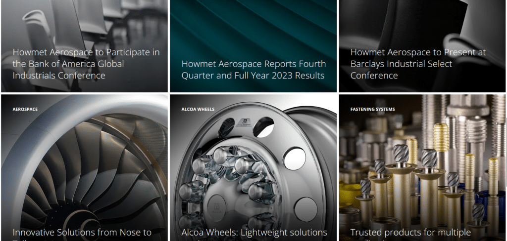
If you want to learn more you scroll down right? But here we’re just met with more oversized images forced to occupy as much space as possible while providing little helpful information. With the intent to be artistic, it failed to be helpful and informative.
Pro-line Boats
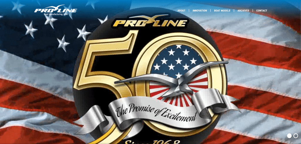
If I didn’t wait a few seconds more, I wouldn’t have known this page is for a boat manufacturing company. This is another example of wasteful use above the fold. Upon loading of the homepage you should already give the reader an idea of who you are and what you do in just a few seconds.
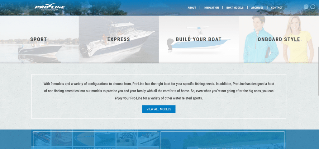
Scrolling down the page, it’s not too bad but it could be better. The 9 models of boats they say they have, could have been placed as a clickable carousel that leads to each of those 9 boats’ individual pages.
Carlisle Plastics Company
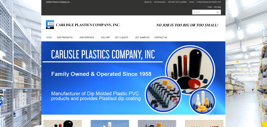

From their above the fold section, can you guess the number of times their company name shows up? (I’ll give a free e-book: Xtreme Homepage Makeover Guide to anyone who can guess it) You can see they’re almost there with their design but fall short in where it matters.
You need to arrange information in a way that there’s a distinct separation so you can skim easily in just one look. They did get it right in effectively conveying their company’s identity and service. Their review box is so dull and insignificant I almost didn’t notice it until I took a proper look.
Essentially this homepage, had the right intent but lacked in execution.
Crown Metal Manufacturing
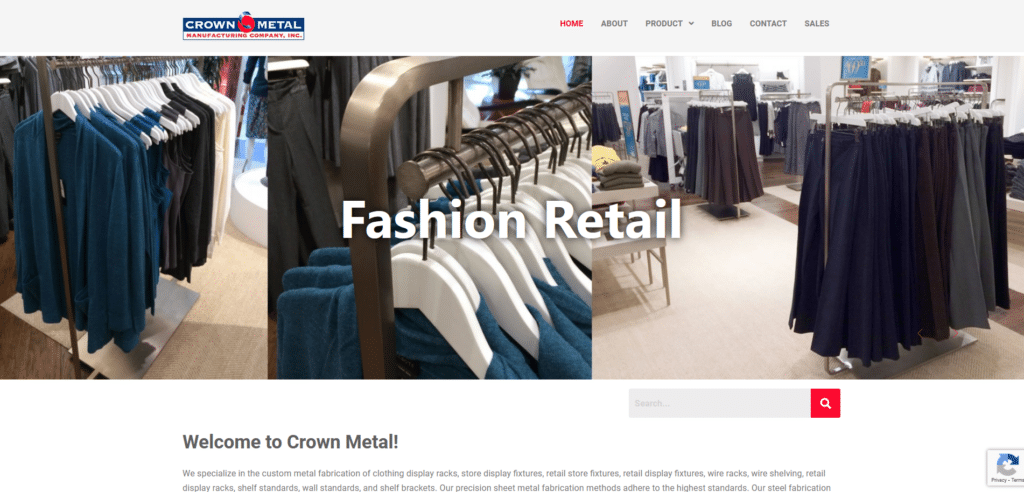

One way a homepage fails is when it confuses the reader regarding its identity. If you have a logo that says Crown Metal but your hero section says “Fashion Retail” or “Grocery”, a reader might decidedly skip your page thinking they opened the wrong one.
Use your hero section as a way to visually communicate your services without leading into confusion. A small change like rewriting it as “metal works for Fashion retail” or “metal shelving for Groceries” would have made a massive difference!
There’s also room for improvement in their excessively lengthy call to action sentence. They could have said “Crown Metal has an Award-winning Customer Service!” then underneath is a button that says “Contact Us”. Their contact number would be much more helpful at the header section.
Harrison Manufacturing Co.
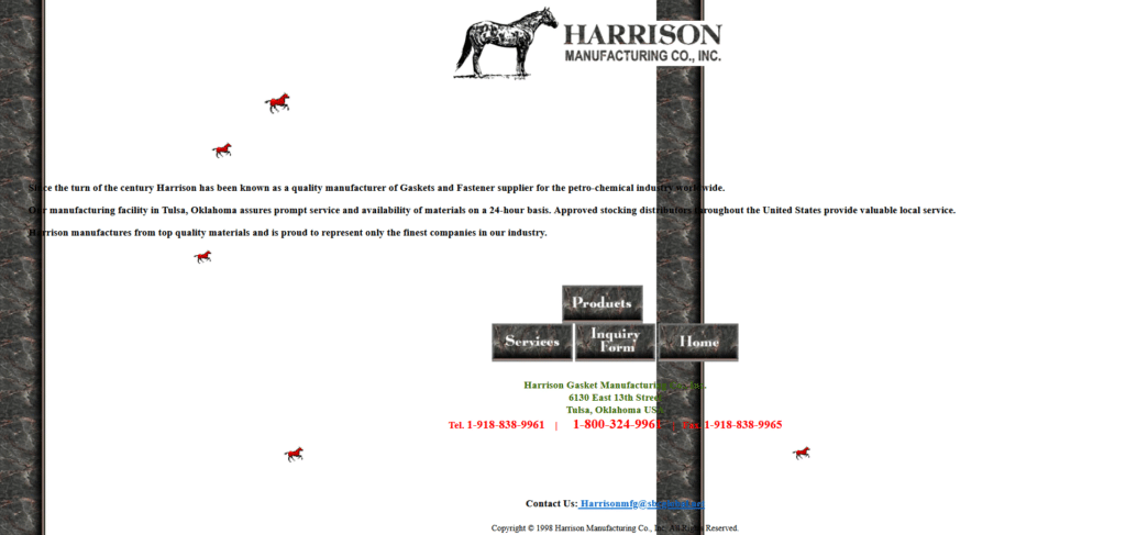
I won’t lie, this website effectively entertained me. Those tiny gif horses running across the screen, LOVE IT. You know how some homepages are so bad they’re good? This is it. Unfortunately it’s not the type of company homepage that’s going to assure you of great standards.
This is the kind of homepage we are asked to build as homework for our computer class mid-2000s. To be honest I’m not sure if this company is even still active. If it’s not, I commend the server that is still hosting this ancient website.


