5 Non-profit Organization Homepages That Inspire You To Donate
Explore five non-profit homepages that brilliantly inspire action and support through compelling design and storytelling.
When you land on a non-profit’s homepage, it’s like walking through their front door. You instantly get a feel for who they are, what they stand for, and why their cause matters.
It’s not just about slapping some nice photos and catchy phrases online; it’s about making you feel something real and moving you to actually do something about it. Amid all the noise online, some non-profits really know how to stand out and tug at your heartstrings or fire you up to help. They’ve got this knack for pulling you in and making you want to be part of their story.
So, we’re diving into 5 non-profit homepages that are absolutely killing it at this. They’re not just nice to look at; they make you want to whip out your credit card and contribute to the cause. Let’s check out what makes these sites more than just a pretty face in the crowded world of online giving.
Spaymart
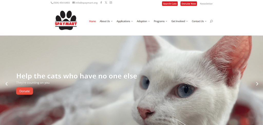
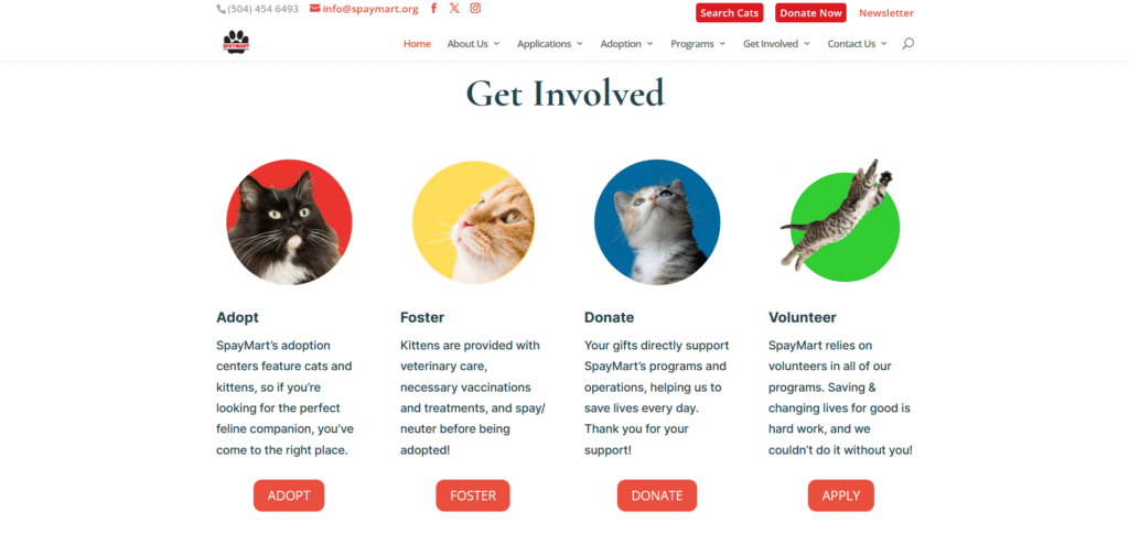
Nowadays it’s easy to connect with a cause that involves animals. With thousands of organizations out there with the advocacy for certain animals, it can get pretty overwhelming deciding who to support. What matters to a donor? What information is helpful?
Spaymart focused on delivering vital information that emphasizes the success of their advocacy. More than just a homepage that trumpets their cause, they also provide helpful call to action buttons that will easily get you to the next step for support.
Colorado Ballet
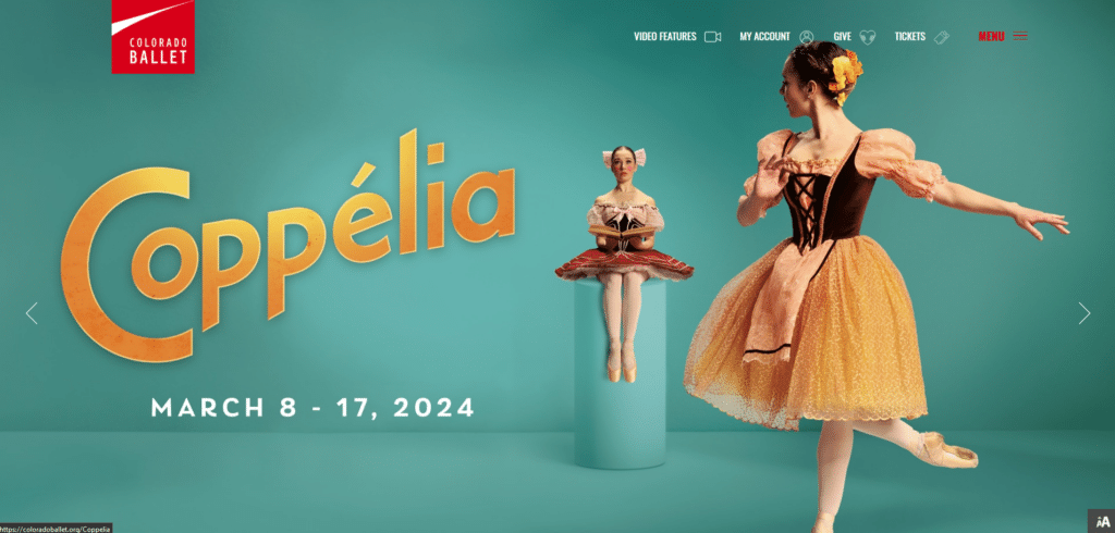
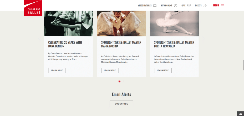
Clean and graceful, this homepage reflects what ballet is all about. The refinement and artistry is appreciated. What makes this homepage a winner is also how they’ve incorporated the big names that are supporting their cause further legitimizing their organization.
It’s really not about how much information you’re laying out on the homepage; instead it is about what kind of information gives value to those wanting to learn about your advocacy. Carefully planned content and a seamless mobile experience, this homepage is definitely getting those donations.
Perhaps for your own homepage, you don’t really need to fully redesign and follow this kind of homepage. Sometimes a few small changes (we cover this in our Homepage Design Guide) you can significantly experience increased engagement on your website.
Rainbow Hospice Care

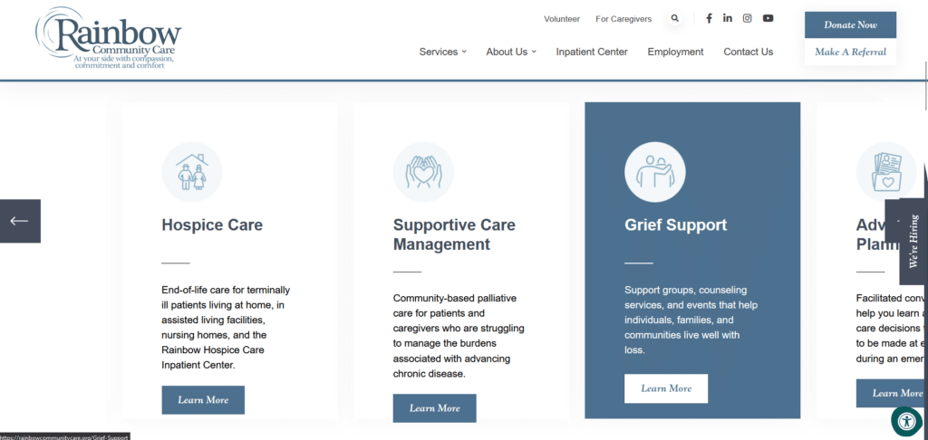
Above the fold, I like how different elements are distributed all over instead of bunching up together which can get readers confused. Important links and socials are listed above, the donate or referral button conveniently seen at the top right corner, and a hiring button runs along the homepage as a side tab.
They offer links to resources where helpful information can be found instead of overpopulating the homepage with all those resources. A clean carousel works well for them and it makes for a good flow of content horizontally.
Go Local YYC
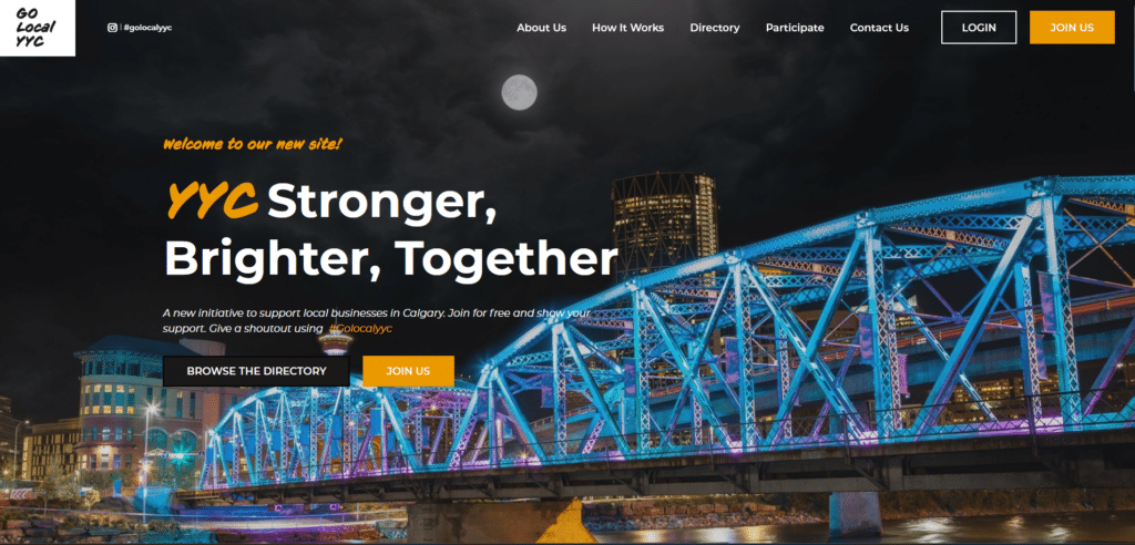

Compared to the other non-profit organization websites, this stood out for me because of how bold and high-contrast the colors are. Most of the other homepages I saw went for a more softer and approachable color-scheme.
After scrolling down I then understood the vibe they were trying to project with this kind of design. I love how their cause was easily explained in one section of clean iconography and simple to read text. NO overly long paragraphs which I have no time to read.
They also did not waste any time in collecting your information for recruitment just below the explanation about their cause. If they’re this efficient on their homepage, how much more for how they run their cause?
RAIN
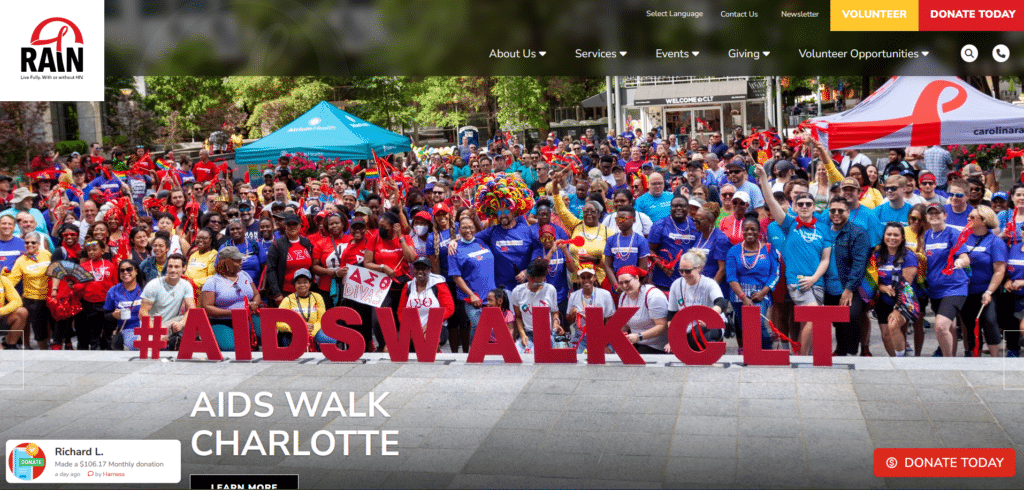
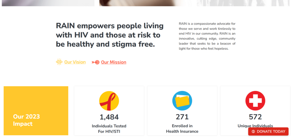
Here’s an example of a homepage that takes their call to action button seriously. The “Donate Today” button does not leave your sight as you learn more about what their advocacy is about. Cleverly placed on the lower left corner above the fold, you can see information about others who have already donated.
Although their homepage is far from perfect, there are some areas that could be simplified, but the whole feel of being dynamic, informative, engaging, is why this homepage has made it to our top 5.
Being Charitable to Your Readers
Wrapping up our deep dive into these standout non-profit homepages, it’s clear that making a real impact online goes way beyond just looking good. It’s about creating a space that resonates with people on a personal level, making them feel connected to the cause and eager to contribute.
From Spaymart’s focused message and actionable steps to Colorado Ballet’s elegant presentation; from Rainbow Hospice Care’s well-organized resources to Go Local YYC’s bold and efficient design; and finally, RAIN’s persistent call to action, each of these organizations proves that a thoughtfully crafted homepage can be a powerful tool in driving support and making a difference.
So, the next time you’re browsing the web and stumble upon a non-profit’s homepage, take a moment to appreciate the thought and effort that goes into making you feel welcomed, informed, and inspired to join their mission. These five non-profits have shown that with the right approach, it’s possible to cut through the digital noise and touch hearts, one homepage at a time.