5 Non-profit Organization Homepages That Make You Hold On To Your Money Instead of Donating
Explore common pitfalls to avoid in non-profit homepages to ensure your site captivates and motivates potential donors.
In the world of philanthropy, where every click could lead to a generous donation, the power of a well-crafted homepage cannot be underestimated. Yet, not all non-profits manage to hit the mark.
While many organizations strive to create compelling online spaces that inspire visitors to open their hearts and wallets, others inadvertently achieve the opposite. It’s a delicate balance between invoking empathy and action, and missing the mark can mean the difference between support and skepticism.
As we explore the digital doorsteps of various non-profits, we uncover five notable examples where, despite good intentions, their homepages might leave potential donors clutching their credit cards a little tighter, pondering if their contributions would truly make an impact.
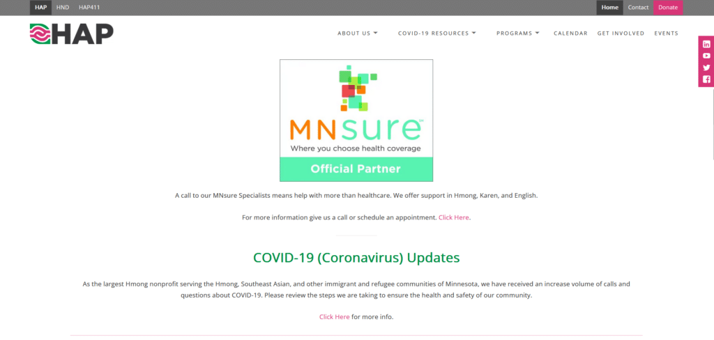
HAP
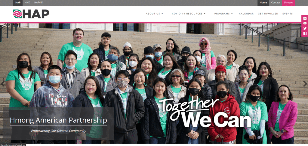
To start with I want to be fair and mention that above the fold, they didn’t do too bad. It’s clean, it’s clear and I already get an idea of what this organization is about. However, immediately after I scroll down that’s when I start to question what this website is for.
Where’s the info about who they support? What numbers have they to show for in terms of what they have done so far? Is this a Hmong support org or a health insurance sign-up homepage?
This is why information selection is important. Don’t assume that everyone who visits your page is fully aware of who you are and what you do.
Solid Ground
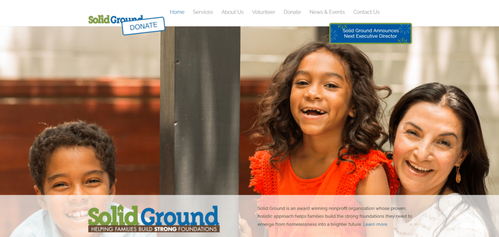
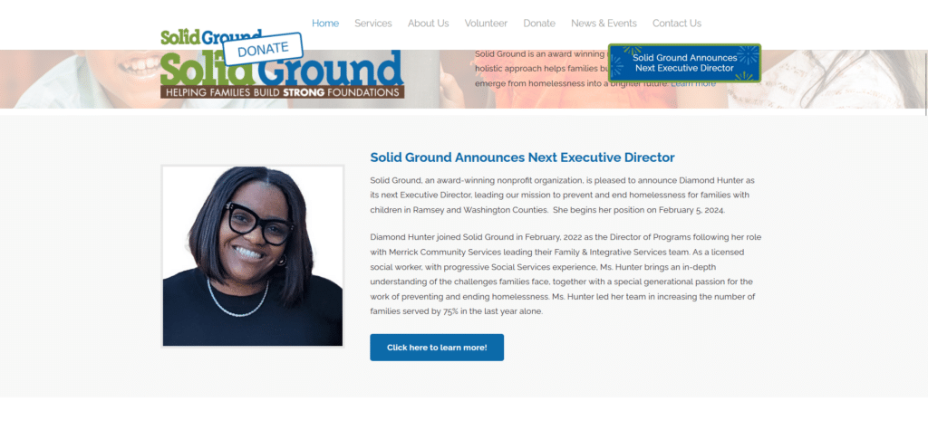
For this homepage I won’t comment so much on the homepage design itself as I think it’s really not that bad. Where I feel it falls short on, is what content they are pushing as priority. Why is it more important about who the new director is?
There’s good stories told in thumbnails and video titles, but this could have been pushed up higher in the content priority and visualized with easy to read text summaries as well as engaging visuals. Everything else they did quite okay.
However, if they tried to follow how these non-profit homepages did their info placement, they could definitely be out of this list.
Power Forward Utah
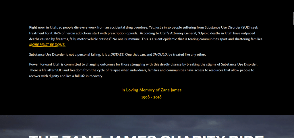
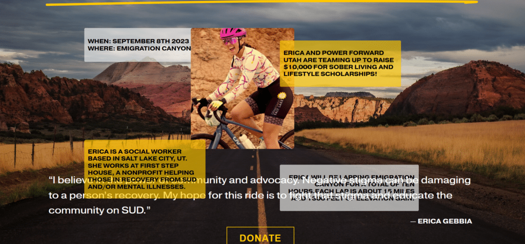
Text after text after text after text. It’ll take me a good portion of my time to carefully read what this is all about. There’s a section on this homepage that has some sort of visualization and key details about the cause but even that wasn’t really clear to read with the overlapping content.
Some good from their homepage are the numerously present donate buttons to encourage engagement. It’s just sad that some people might take one look at the numerous things they need to read and simply close the page thinking “Eh, maybe not today.”
Understanding Us

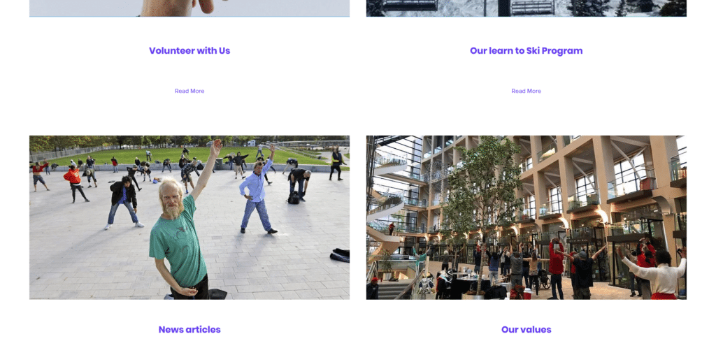
If at the end of scrolling a homepage you still don’t know what the organization does, then there’s some serious reconsideration that needs to be done. This is what I experienced for this page. Is it a Tai Chi program? Are they offering classes?
It wasn’t until I clicked on their about us did I learn what they stood for. Above the fold they could have started with an image banner with text that says “We are a non-profit organization providing support to the homeless in Salt Lake City.”
It’s ironic that the name is “Understanding Us” but I didn’t really understand their cause from going through their homepage.
Coco’s Heart Dog Rescue
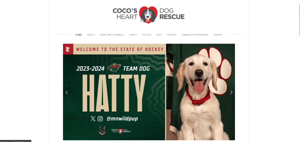
Please don’t use your homepage’s welcome banner section, as an events billboard. If you’re focused on just making the website for internal use, then yes that’s fine. But if you’re trying to get more people who are new to your advocacy, to donate then don’t miss the opportunity to be creative and effective.
Above the fold is one of the most crucial sections that can encourage a reader to scroll on or close the page. You want to have a message or an image that connects with the reader just as the homepage loads.
If you are unsure what to put on your homepage, we have an Xtreme Homepage Makeover guide you can download for free.
A Better Homepage for A Stronger Cause
Our journey through these five non-profit homepages reveals a spectrum of missed opportunities and lessons in digital engagement. From the cluttered and confusing to the vaguely informative, each example underscores the critical need for clarity, compelling storytelling, and immediate engagement.
As non-profits strive to capture the hearts and minds of potential donors, the key lies in presenting a clear, impactful message right from the first click. Let these examples be a call to action for non-profits everywhere: your homepage is not just a digital front door; it’s the beginning of a relationship with those who can help you make a difference.
Crafting it with care, precision, and a deep understanding of your audience is not just beneficial—it’s essential for turning interest into action.


