5 Pest Control Company Homepages That Make Rats and Roaches Scared!
Discover top pest control companies excelling in engaging homepages, designed to prioritize client needs and build trust instantly.
The pest control or removal industry is one that any homeowner has contacted at least once in their lifetime. Everyone deals with pests and when it gets more challenging than a normal DIY solution, we call the professionals.
While there are plenty of professionals out there, only those who project the image of being able to get the job done are the final choices of prospective clients. These 5 Pest control companies show you how it’s done through their effective homepages.
Gopher Trapping Pros
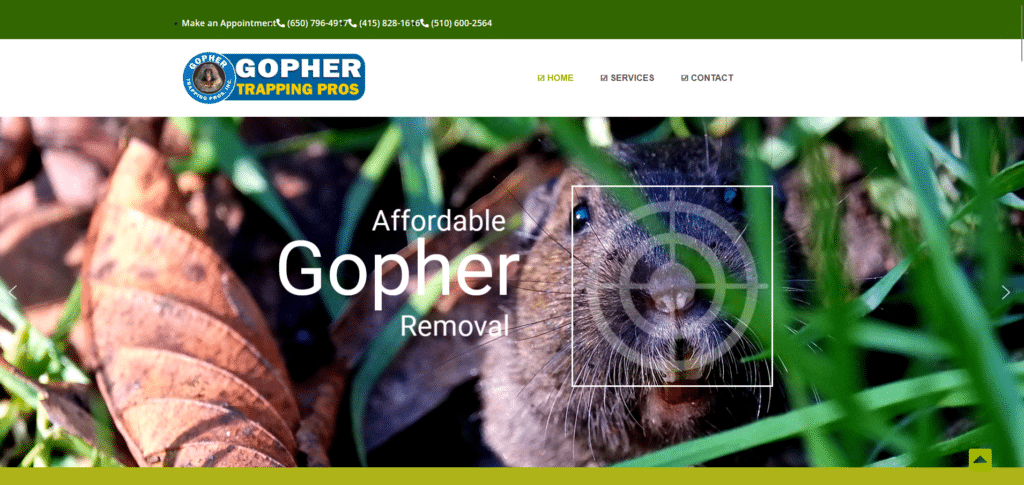
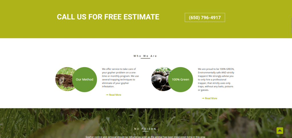
With the combination of color use, direct to the point messaging, and easy to find contact number, this homepage immediately tells the reader “we have the BEST solution to your problem” without saying it literally.
Low-commitment offers like a free estimate is enough to get a reader to engage with the company and if these exterminators are professionals, it won’t be long before they converted the reader into a client.
They know how important it is to get in touch so they constantly shared their contact information all throughout the page.
Pest Management of Texas
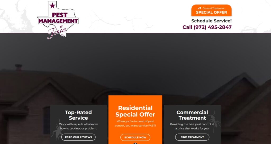
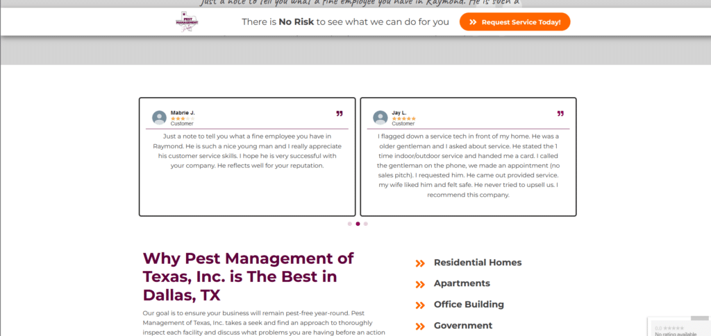
I can’t stress enough about how important it is for company homepages that are service-oriented to have customer reviews on the front page! This company knows that and have shared their positive experiences with their services.
Following the foot steps of the first example, they’ve taken a proactive approach of offering a low-commitment offer to get readers engaging. If you’re interested how to do it for your own homepage, we talk about this technique in our Xtreme Homepage Makeover guide.
Termio
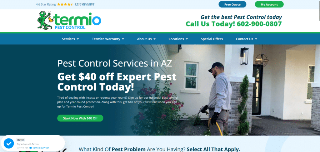

For company homepages that take an extra step it in being creative with their visuals, you guys deserve a pat on the back. Who says service homepages need to be boring? This homepage took the good practices of homepage design and made it engaging.
Above the fold they fitted so much information and yet it doesn’t look messy because of how they used font colors, sizes, spacing, positioning and copywriting! Extra points again for how they designed their offers like digital coupons people can redeem.
Engagement is the goal, and these people are killing it!
Clancy Bros Pest Control
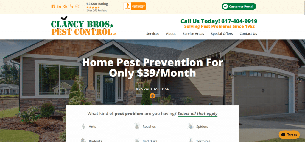
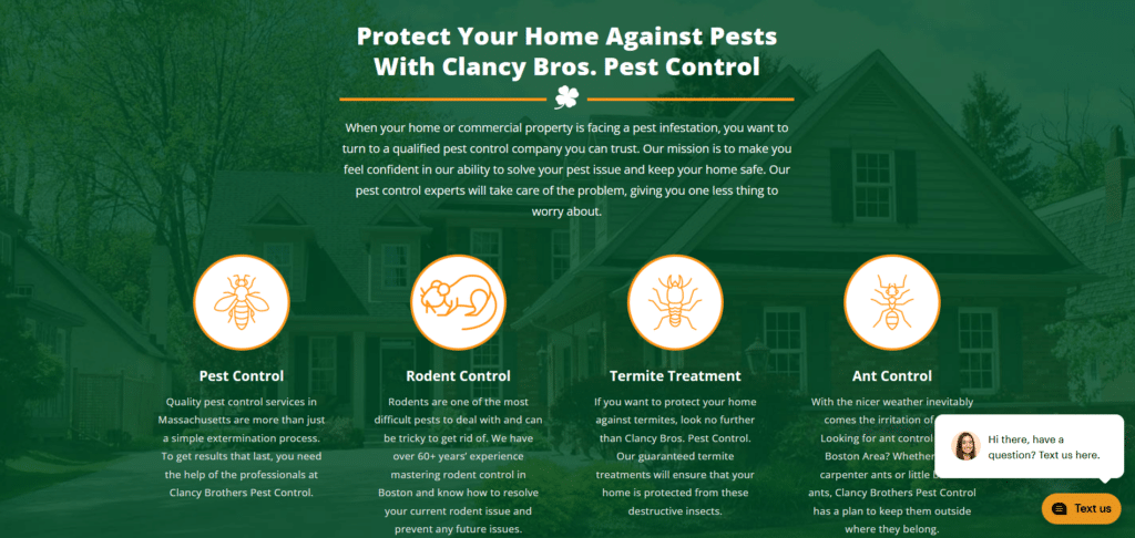
Designing a homepage does not require overthinking. If you compare this homepage with the one just before this, you can see how they employ similar strategies in placing information above the fold. Above the fold should NEVER be taken for granted.
I see a lot of homepages that use this most visible section of the homepage as some sort of art gallery that doesn’t offer help or value to their page visitor. This company’s homepage even offered a convenient pop-up messaging call to action button so you can easily reach them before you exit the page.
Mosquito Squad

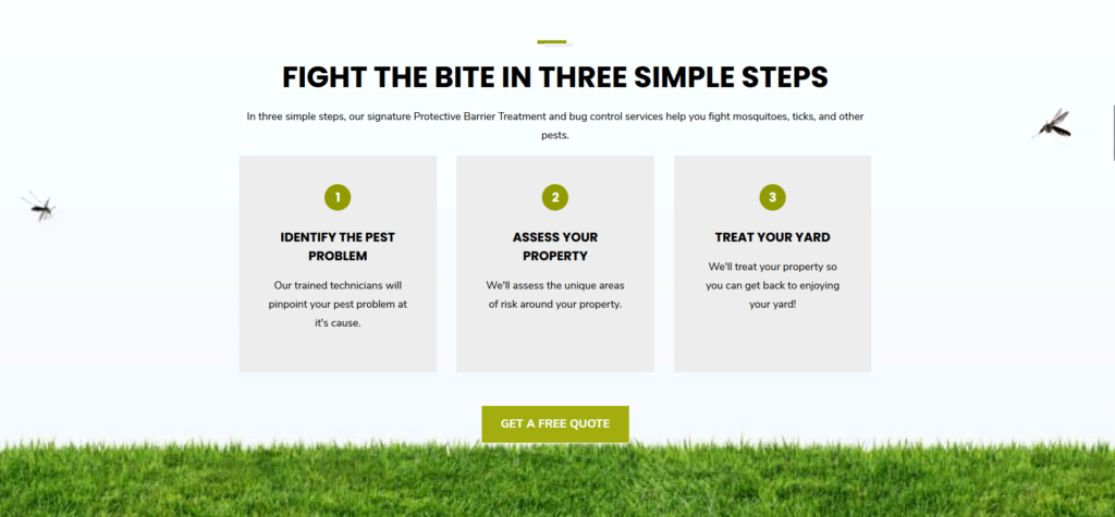
Service-based homepages should focus on trying to provide anything helpful to those searching for them online. They don’t want to be looking at awards and badges that companies want to boast about. Follow this company, they tell clients how they work in an easy set of visuals.
If you want to provide a service, make sure your homepage reflects that intent. When you provide helpful information your reader is bound to stay longer and actually trust your brand. This is what Mosquito Squad is doing, being helpful and then offering an easy way to get in touch with them.
Professionals Prioritize Client Needs
In order for clients to build a sense of trust you need to show them that you genuinely want to help. That is easier done when you’re already communicating with the client. That is why it’s vital to get them to engage the moment they have their first visit on your homepage.
When you make your homepage fun to read and browse, those positive feelings of the reader will increase the chances of them choosing you or at least getting in touch with you. After that, it won’t be that difficult to sell your services especially if you’re a professional.


