5 Pet Grooming Homepages That Can Earn The Trust of Pet Owners
Explore how these five pet grooming websites excel in creating professional and engaging homepages.
Choosing a pet groomer is not as simple as selecting food off from a menu. The animal companion at home is practically family to you and grooming is a very important and sensitive service so you want to make sure that not only are you choosing a professional, you’re choosing safety for your pet.
Because of that need for assurance and a guarantee of professionalism, pet grooming websites need to be able to make the best first impression in the first place anyone might be able to find them: online. How are your websites in communicating key messages? Is it convenient and easy to navigate? Are you providing easy ways for clients to reach you?
Here are 5 websites that got the formula right and are easily gaining the trust of thousands of pet owners!
Groomit
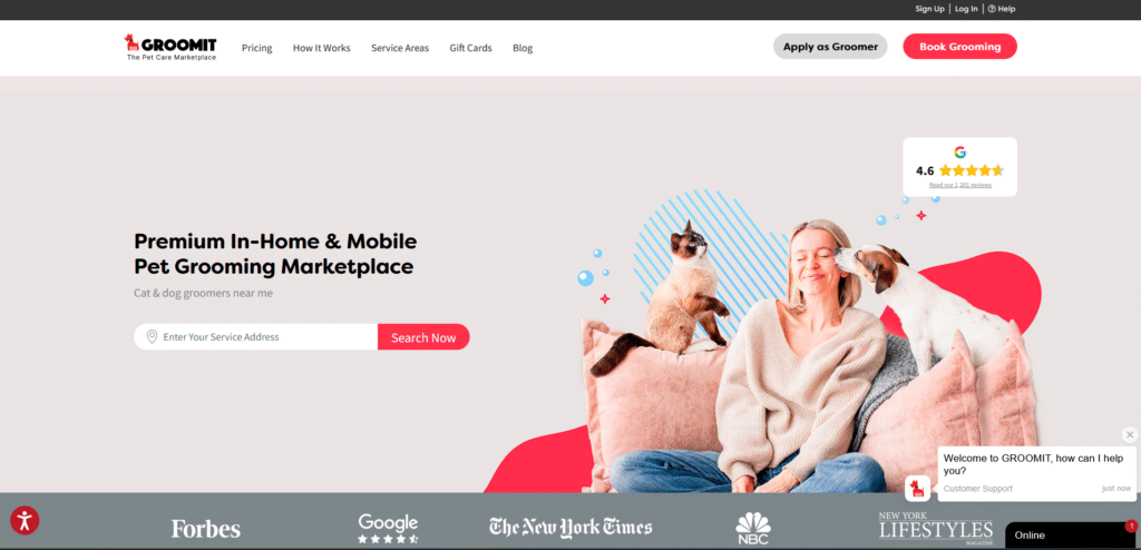
Groomit is an example of a brand that has it figured out. They check out on a lot of very important best practices covered in our Supercharge Your Local Website guide. From displaying reviews from real people, communicating their services in an organized but brief manner, and even to strategic placement of clear call-to-action buttons.
Bonus points for them for adding a live chat option in case you already want to book an appointment as soon as possible without having to send an email and wait for a response. Not only does the homepage look clean and beautiful, it really is clear about who they are talking to and what they have to offer.
Upper Hound
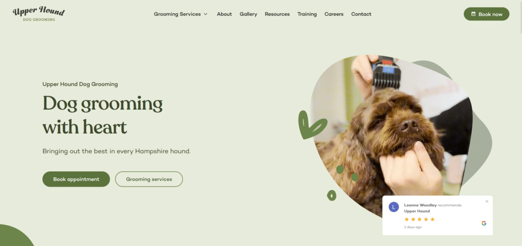
When you want to take a step away from looking corporate or just too similar to other homepages, then have a look at Upper Hound’s approach to design and function. They organic green shades splashed throughout the whole page provide this natural feel that tells us “we care about nature, and we care about your dog.”
Relevant visuals paired with great copy, effectively educates the visitor of what services they offer without overwhelming the reader with too much information. The blend of beauty and functionality makes it such a pleasure to read through the entire homepage without feeling like I’m forced to read something.
Furr Pet Spa
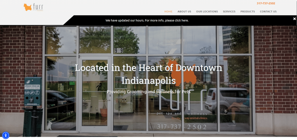
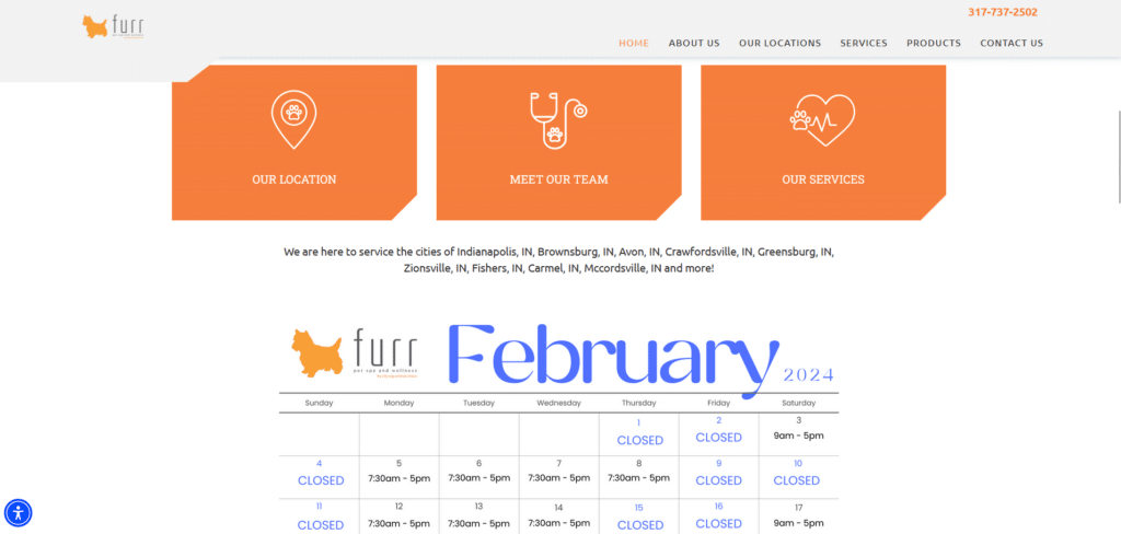
Now before any web designer calls me out for choosing this homepage, I want to say that yes there could be improvement in the choice of banner photo above the fold. However, the reason why this homepage made it into this list is because of the choice of content in the rest of the homepage.
Great homepages are not just about looking beautiful, they’re about providing value to readers and this pet grooming website knew exactly what their visitors wanted to find out without having to provide a labyrinth of links before they get answers they need. If you are a service provider that needs hours booked then having a some way for clients to book you in real time, would be helpful.
Calendly as a scheduling solution is one of the apps we use in SuperWebPros among other productivity apps that help businesses.
Miss Meow
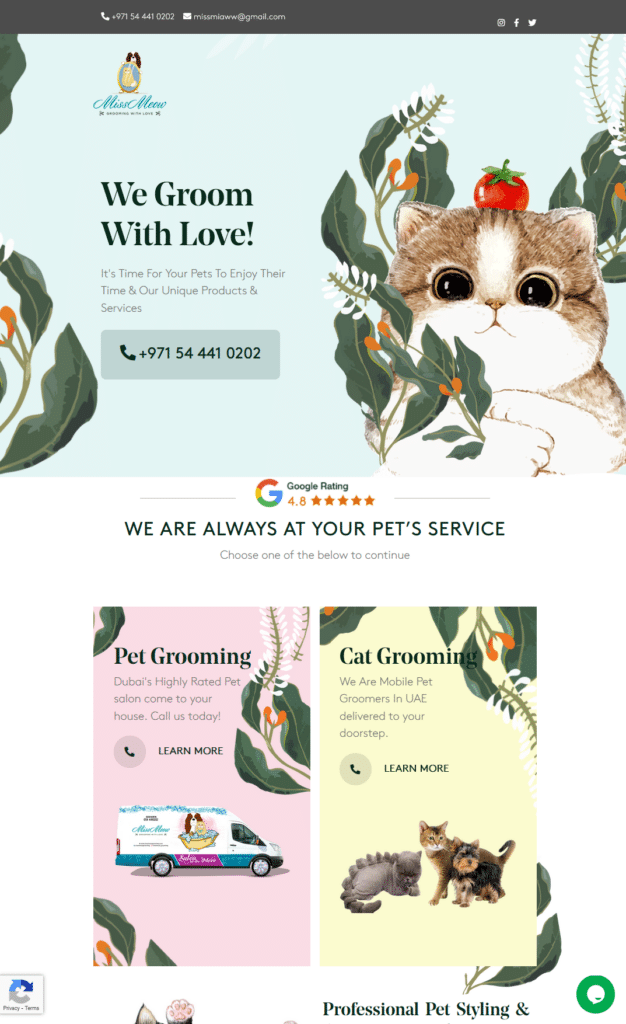
Some might say I’m biased towards dog grooming websites but hey, that’s not true. It is just that dog grooming websites far outnumber cat grooming sites. Thankfully this one (although they also service dogs) is one that visually targets cat owners.
With a homepage design like this, you can’t help but stop and take a good look. We cannot resist a star-glazed pair of eyes that look into your soul. But if you take a closer look in the information they have included on the page, you can see why they’re a top performing homepage.
Easy to find contact number? Check. Google reviews for assurance? Check. Easy to read information? Check. They truly are a good homepage example.
Blue Wheelers
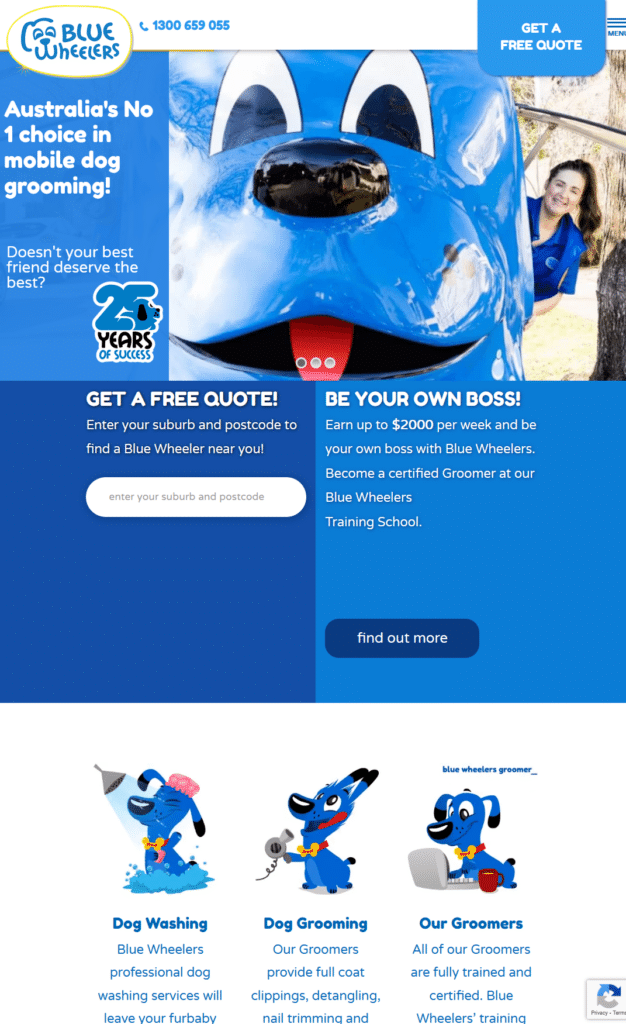
While most of the pet grooming websites take on a more aesthetic or corporate approach, this homepage got our attention because of their fun and animated vibe. Instead of a linear approach to providing information, they have managed to compress the most important information just above the fold.
Even as you scroll down you have these fun visuals that tell us more of what they do as our eyes are guided accordingly to learn more about their services. They also do not lack in the call to action button and very clear contact number cleverly placed at the top part.
To Be A Professional You Must LOOK Professional
It’s easy to say not to judge a book by its cover but in any industry, a customer will often take one good look at whatever you have to show for your first impression and make a judgement. Why wouldn’t they? There’s just so many choices of services nowadays!
Thankfully doing a few simple changes on your homepage can drastically improve your website visitors’ experience. That also means you don’t have to do a full website rebuild if you want to start improving your homepage for a more professional look. Learn more about how you can make at least 12 changes on your homepage that will supercharge your local website!


