5 Professional Consultancy Homepages So Impressive You Want to Partner on The Spot
Learn from the best: Explore how leading consultancy firms use their homepages to show expertise and build trust with potential clients.
To be an expert in your industry you need to show how knowledgeable or experienced you are in the field you specialize. If you are surrounded with people who claim to be consultants, you can easily weed out the good ones from the bad ones based on how they talk.
The ones who know their craft don’t really say a lot but with the little that they do, they exude excellence and expertise. Those who claim they do will say a lot of things to seem like they know what they’re teaching.
Same goes for a company’s homepage, what you put in there, the important things, will affect the very first impression anyone makes when they visit your website. Here are 5 professionals who have done it right for their own homepage.
The Goldstein Group
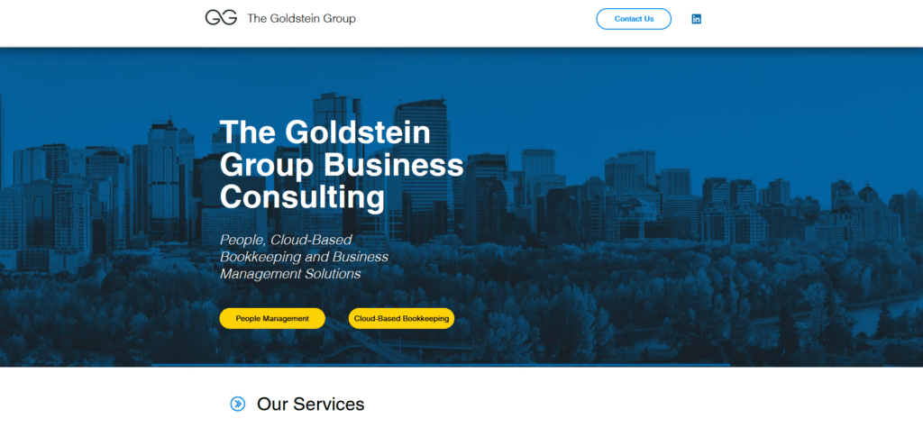
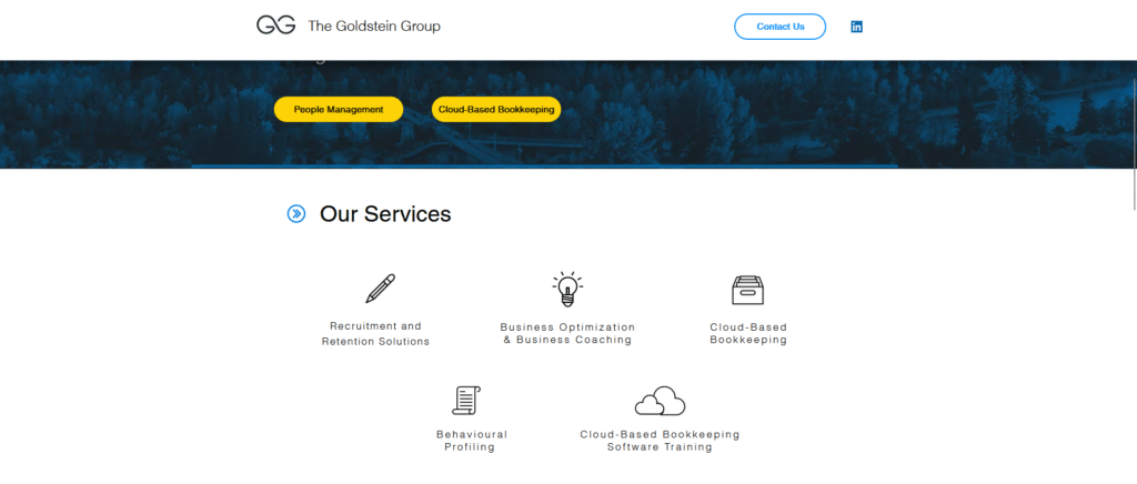
Cleverly placing their services in an easy to read group of visuals. There’s really no need to dive into the deep specifics of what they do. Keeping it simple will immediately give the reader an idea whether this is the company they are looking for or not.
Easy to find call to action buttons such as their contact information, is located conveniently on top and also at the very bottom of the homepage. If people do decide to work with you, you don’t want them to delay any further in trying to reach you.
FourFold
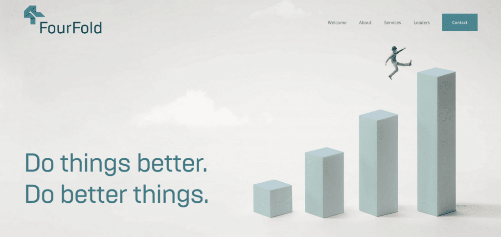
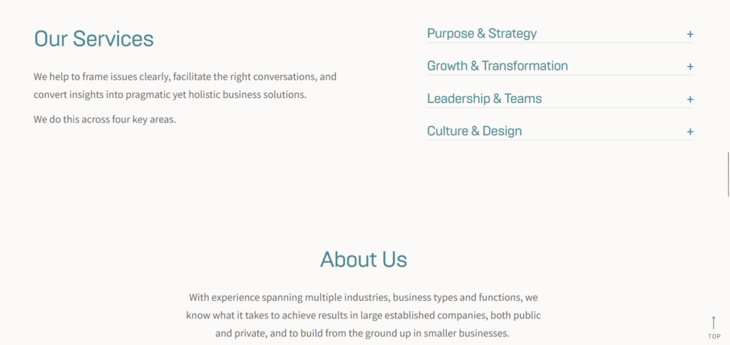
FourFold, a consultancy firm in Australia, knows how to combine a corporate look as well as creative communication. They understand that time is of the essence and visitors only need to read the essentials. You can see that they didn’t need to overpopulate their About Us and have provided necessary links to direct readers to more details.
The whole homepage is a journey of introduction, from their key message, what they do, who they are and finally a convenient section where you can immediately send them a message without having to step out of the page. They really know how to “Do Things Better”.
Bridge Investment Group
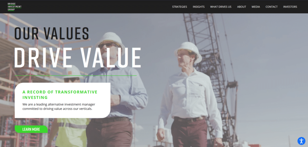
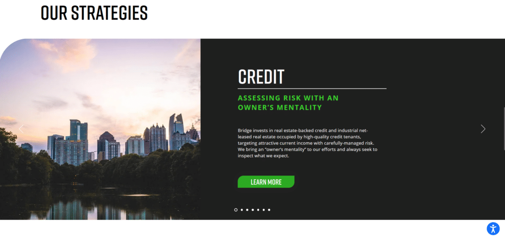
Stunning visuals that immediately grab your attention above the fold, this company’s homepage got every aspect of the reader’s journey carefully thought out. Now I know I’ve praised heavily those pages that keep their text to a minimum.
For Bridge Investment Group I have given a slight exception because the text they have placed, are properly formatted so that skimming the content is easy and you don’t get lost in the content. They know they have to provide information but utilized functional formatting to do that as well as keep it organized.
Bain & Company
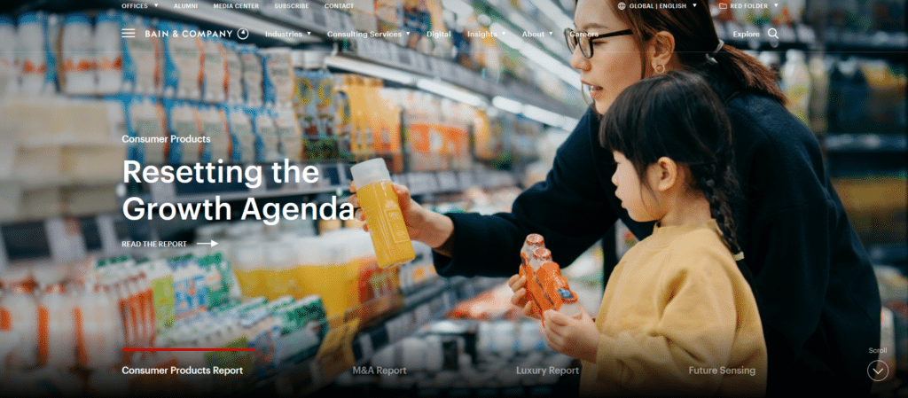
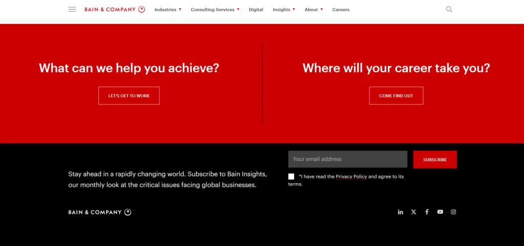
Here’s another homepage with stunning visuals and rich content that basically showcases that they as a consultancy firm, know what they’re talking about. It wasn’t so much that ALL their content was placed on the homepage but there are snippets leading to other pages that provide value for the reader.
Ultimately any website should aim for engagement. It could be providing a contact form for easy messaging or in this example, call to action buttons that are hard to miss which will encourage an action from the reader.
Navigate
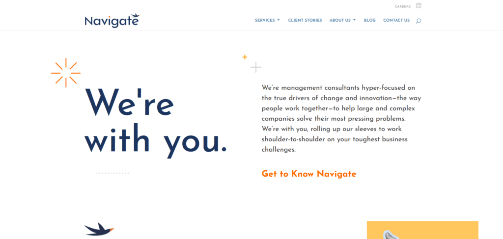
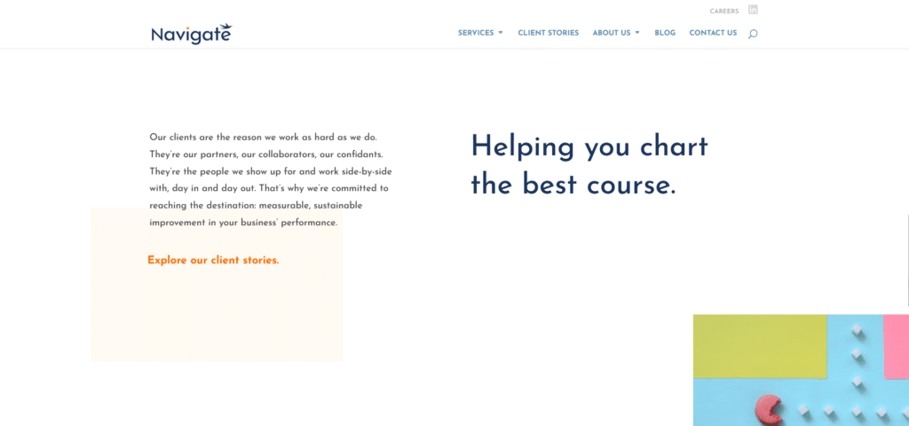
While most consultancy companies will talk about what they are capable of doing, Navigate has taken their storytelling approach on their homepage with a pathway leading to their client stories. In any company homepage that provides a service, reviews or testimonials can possibly be all the difference that it makes for a new visitor to decide whether to trust you or not.
Navigate’s homepage feels like a smooth flow that gets you from one information to another. Instead of wanting to merely skip everything I see, the content feels connected to each other and this is important to getting your brand across. The company address and contact number definitely reinforces this page’s legitimacy.
It’s Not How Much You Say, It’s What You Say
There are several instances where the saying “less is more” is applicable. Especially in the world of consultancy, experts do not really need to be loudly heralding every single bit of information for everyone to hear. They are experts because they know exactly what information is important and what does not really add value.
Treating your homepage as if you’re a consultant, you will be more focused on how the information on the page impacts the reader. Is it valuable? Is it helpful? That kind of professional consultant mindset is what we employ in our Xtreme Homepage Makeover guide which has effectively helped several of our clients.