5 Professional Healthcare Homepages Where Trust and Care Meet
Explore top healthcare homepages that combine design, clarity, and patient focus to inspire trust and confidence in your healthcare choices.
When you’re looking for healthcare options online, the vibe of a website’s homepage can really make or break your decision to dive deeper. It’s kind of like online dating for healthcare—first impressions matter a lot!
You want to feel that instant connection, knowing you’re about to trust these folks with something super important: your health. So, imagine landing on a homepage that instantly gives you the feeling of assurance, making you think, “Yep, these are the people I want taking care of me.” That’s the gold standard, right?
In this article, we’re cruising through five healthcare websites that totally nail it. They’ve got that perfect mix of approachable vibe, clear info, and a feeling that says, “We’ve got you.” It’s like finding a healthcare buddy who’s all about making sure you feel understood and looked after.
Synergy Private Health
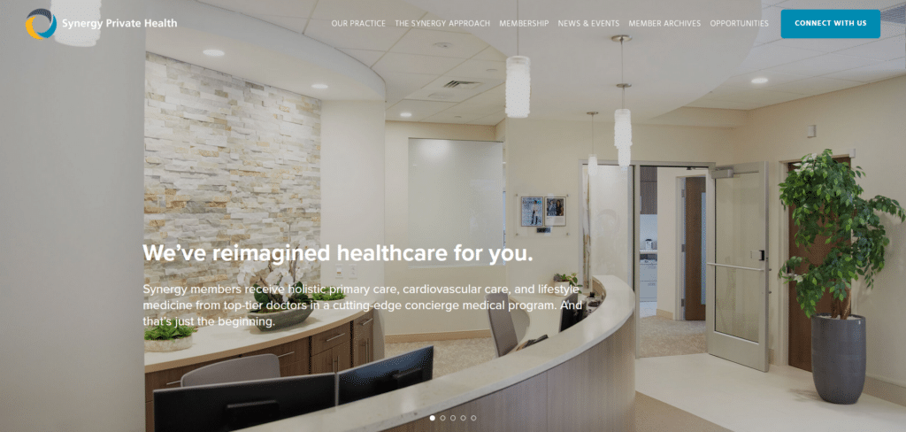

Most of the healthcare homepages, even with their updated or modern website themes, still felt cluttered with all the content they populated on the front. Synergy Private Health took a cleaner approach with creating a feeling of entry into their facility as their above the fold section.
Scrolling down you have brief information of specific topics that gets the reader informed in a matter of seconds. It’s not also just about telling the web visitor who they are but also offering a next step for engagement through their call to action buttons.
Athena Health
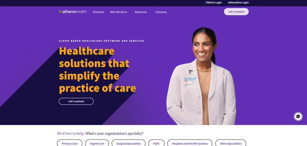

Beautiful design with creative use of colors to project their brand image, this homepage knows what it means to guide a reader down a path that is beneficial both for the visitor and the healthcare service provider.
Some of the practices here such as clear call to action buttons, customer review carousel, and a live chat option, are great features that we highly recommended in our Xtreme Homepage Makeover Guide. This goes to say it’s not just about making your homepage look nice but actually provide help to your new visitors.
Mayo Clinic
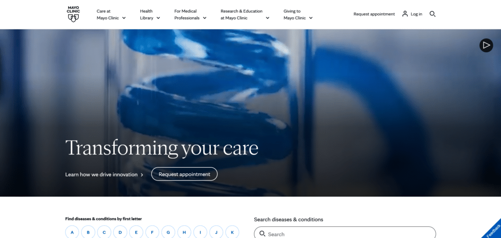

Creating a sterile environment ensures that patients get the best care without worrying about nosocomial infections (infections acquired from the hospital). Somehow Mayo, a very popular healthcare brand, has taken that concept of cleanliness and projected it on their homepage.
Sure they have the usual information such as locations, appointment setting, and directions, but they have also included a directory for medical conditions and diseases. They know their readers are looking for helpful information and they spared no effort in providing just that.
RUSH
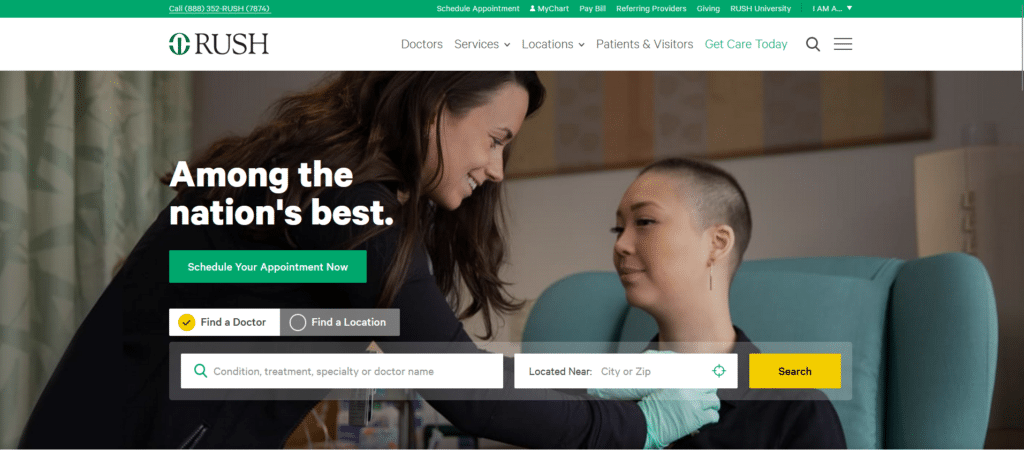
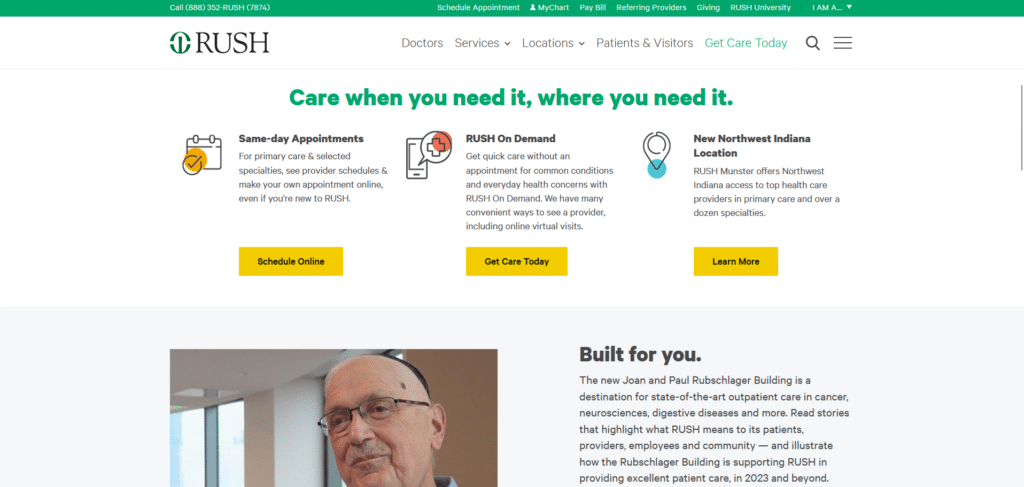
RUSH’s homepage is an example of one that knows how each space above the fold is important and should not be taken for granted. Top most ribbon are helpful links but discretely placed instead of taking the full attention at full glance. Easy to find, but not glaring.
Scrolling down after the helpful search tool, they give information probably derived from what most people ask about. They educate a reader without overwhelming with too much info. If this is how helpful they are online, I can imagine what they would be like as a service provider.
Boston Medical
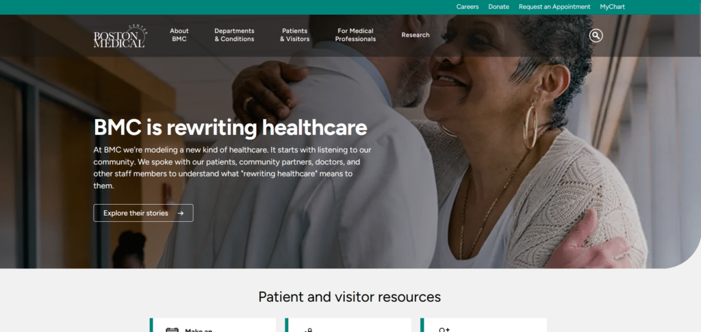

There are healthcare facilities that claim they care about their patients but when I see their homepage, I can’t see their claim reflecting in their homepage. BMC is NOT one of those facilities. Instead of seeing some sort of a product that a pharmaceutical company wants to push, or faces of their doctors, I see what they believe and stand for.
Directly below their homepage banner, are already helpful links for patients and visitors. They also shared their patient stories which is what I would like to think is the equivalent of a “customer review” for hospitals. Effective for gaining trust without having to do a litany of awards the hospital received many years ago.
Your Homepage Is The First Impression Patients Have of You
As we wrapped up our list of five standout healthcare homepages, it’s clear that the ones making the biggest impact are those that prioritize clarity, empathy, and a sense of personal connection. Whether it’s through sleek design, straightforward information, or patient-focused features, these sites know how to make a great first impression.
They remind us that in the world of healthcare, where trust and reliability are paramount, the care and thought put into a homepage can truly make all the difference. So, if you’re on the hunt for a healthcare provider that feels right for you, these websites are a great place to start.
They’re not just about looking good; they’re about making you feel good about your healthcare choices, setting the stage for a relationship built on trust and care from the very first click.


