5 University Homepages That Attracts Quality Students
Explore how top university homepages captivate quality students with exceptional design, seamless navigation, and a vibrant digital campus experience.
Choosing the right university is a big decision for any student, marking the beginning of a new chapter in their lives. In this digital age, a university’s homepage serves as the first handshake between the institution and prospective students, playing a pivotal role in shaping their initial impressions.
It’s here that a sense of community, academic excellence, and vibrant campus life must shine through, compelling quality students to imagine their future within its halls. With that in mind, we’ve browsed the web to bring you five university homepages that stand out not just for their aesthetic appeal or navigational ease, but for their unique ability to draw in quality students by the virtual droves.
Because Universities target a younger audience, they’re dealing with digital natives who only expect a good user experience that gives value to them as readers.
Park University
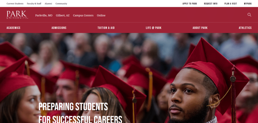
Park University’s homepage is a great example of setting each content category in their own sections without them overlapping each other. So as are you browsing through the page you know exactly what you’re reading and what next steps to take because of the help links that is within each section.
Knowing that students are most likely to be active in social media, they also have a social section where the students can get a glimpse of their social media feed. Big points for the proper design of call to action buttons so people know exactly where to go without having to squint and read.
Loyola Marymount University
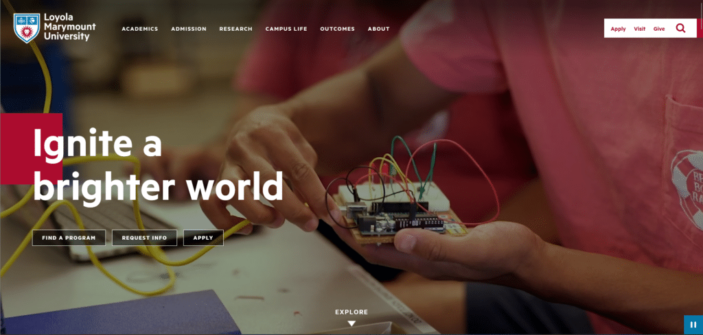
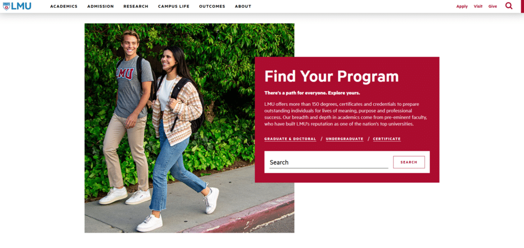
What I liked about this homepage’s design is how they have a set direction for going through the page. Instead of your eyes darting around to check out everything, the sections are made in a way that there is a path they set for you to follow. The content isn’t just static text either, they have sections where you can engage through a link or a search activity.
You really can appreciate a school that cares about great user experience because it’s attention to details like this that you know you will also learn when you enroll in their campus. If they can set an example of being organized at this level, you can expect it as well in their administrative operations.
Condé Nast College
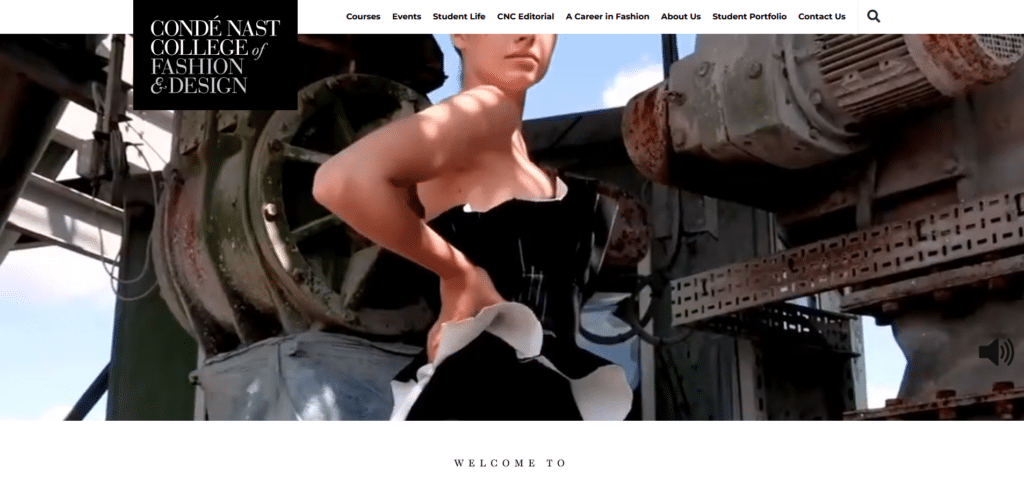
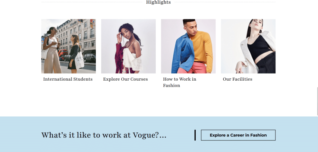
I selected this homepage because it was significantly different in overall look compared to traditional universities. You see this is what I’m talking about when it comes to reflecting your university’s image. Their homepage took a fashion website’s look so it attracts fashion enthusiasts. If they opted for a boring design, it might have repelled the right kind of people.
Although fashion can tend to be daring when it comes to breaking norms or rules, I can see that they’ve held on to the important elements discussed in our Xtreme Homepage Makeover Guide such as effective call to action buttons, visible contact information, brief but helpful curated content, and a mobile responsive design.
Cornell Tech
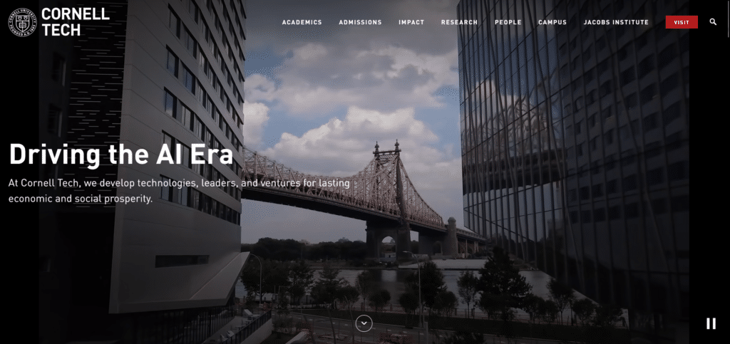


Because of how beautiful and unique each section of their homepage was, I had to take 3 screenshots of this university’s homepage. This is what I’m talking about giving the students an experience they can remember. You want a homepage that inspires and motivates because that is what educational institution do!
To be frank I’m not too surprised they were able to deliver when it comes to homepage design. Technology is all about marrying art and science together. You do not feel forced to read through their homepage, you feel inspired to see more and learn more.
Aberystwyth University
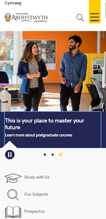

Here’s a look into how to approach mobile responsive homepage design. Can you imagine if they treated this homepage like this massive directory of all the departments of the university? It would be a nightmare to scroll through!
Instead they organized everything so it’s easy to read at a single glance, and you have all the helpful information that a student might want to read about. They even provided a search bar for students looking for a particular course! You want to be helpful to students because they need all the guidance they can get.
Your Homepage Is Your Digital Campus Representation
To be honest it wasn’t very difficult to find good examples of University homepages because schools today really know that they need a good web experience for the students. Digital natives know immediately if there was little to no effort done on a school website.
Gone are the days that people go to the bulletin board for information, or a phone book directory for contact details. The University homepage is all that and more, so you want a positive and helpful experience for the students as they constantly will be opening your homepage.
How does your homepage shape the perception of your students? If you present quality design, you are bound to attract, quality students who have that standard of excellence and mindset.